Tips + Techniques
A Step by Step to Creating a Vintage-Looking Edit From Scratch
May 10, 2018

Camera: Canon 5D Mark III, Lens: 50mm f/1.2L, Exposure: f/2 at 1/2000th of a second, ISO: 640, White balance: 5200K
I have learned over the years that while the photos I’ve taken and the connections I’ve made with my fashion and wedding subjects can affect the quality of my images, the editing process is also a very big part of my work and vision.

The before (above) and after (at right) of a recent editorial.
I love taking captivating portraits outdoors with natural lighting: my subjects are often placed in fields of grass, by a leafy green tree or tucked on a rock by the ocean in the afternoon light. Instead of editing my images with vibrant colors and high-contrast tones, I prefer to create a vintage look to complement the soft and romantic mood I want to portray.
While many photographers love to use presets, I’ve found that it’s been better to completely edit something myself because it sets the tone for my work, brings out my style, and allows my audience to be able to differentiate my work from that of other photographers.
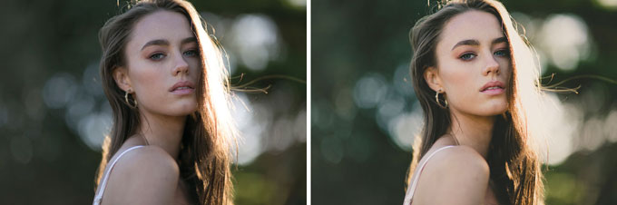
This kind of vintage edit really warms up an image, even on a more close-up portrait like this one, of model Chloe Park. The “after” version of this shot, overall, is more inviting.
Recently, I was photographing in a cactus garden for an editorial shoot and decided to capture a few outtakes toward the end of the day as the sun started dropping into that beautiful golden hour. I asked the model (on the previous page) to stand in the middle of a section of the garden so I could use the plants in the background as a backdrop, as well as some of the plants in front of her for some separation in the foreground. The sun was behind the model and I photographed in completely natural light—no reflectors or extra fill lighting. What follows is a breakdown of how I created this look.

1. Lightroom has a set of extremely powerful editing tools, one of my favorite being the Tone Curve. With the Tone Curve, you are able to completely shift the look of your photo by casting a few simple points and moving them around on the graph—bright and lots of contrast, low contrast and moody tones or, my favorite, muted tones with a slight amount of contrast. In order to achieve the base for my vintage edit, I create what is called an S-Curve.
I start by moving the bottom left point directly up the edge of the graph, which mutes the blacks, making them appear a little more grey. The same goes with the top right point; I pull it down the edge of the graph to transform the stark white highlights of the image into a more muted grey-white tone. Next, I map out three extra points throughout the curve and pull them out into the shape of an S, keeping an eye on how it is affecting my image. With vintage tones, I bring my shadows down to regain some of the contrast lost while muting the blacks. With my whites point, I pull that up slightly to also gain back some of the brightness and contrast into the image from the muted highlights. The point in the middle of the curve refines the overall exposure of the image, so I move it up or down accordingly, depending whether my photo appears too bright or too dark.

2. Regardless of the look you’re going for, exposure, temperature and tint are always a must to tweak. Exposure controls how bright or dark your overall image is. You can pull it down to make your image darker or push the exposure up to make your image brighter. I personally love to go for slightly underexposed in my photos, as I love a moody feel.
Temperature controls how cold or warm your image is, so for the cactus garden image, I brought my temperature up to suit the golden-hour look of the photo. Temperature is particularly important to change when you’re shooting in harsh lighting conditions such as indoors with tungsten light, or outdoors at dusk when the light starts to look a lot bluer compared to the middle of the day.
Tint controls how green or pink your overall image is. Since I am aiming for vintage tones, I move my tint up to give the overall image a subtle pink tint for a slightly retro look.
Next up in Lightroom, we have Presence tools to control the hues. Saturation affects the warmer colors of your image, and vibrance affects the cooler and more muted colors. To achieve a vintage edit to your photo, you can pull back both the saturation and vibrance so no hues are too vibrant in your photo. Or in the case of this photo, I pulled down the saturation a small amount to balance out my subject’s skin tone, making it appear less orange, and I pushed the vibrance up to accentuate the beautiful green location we were working in.

3. Once we have the base of our image set, it’s time to move onto the finer editing details. The tools within Lightroom I focus on when giving my images a vintage look are sharpening to bring out the details of my photo as well as highlights and split toning. I normally bring the highlights down to save any blown-out sections of the image and create an evenly lit photo.
However, for this vintage edit, I pushed the highlights up and blew them out slightly, as I was aiming to achieve almost a look of imperfection in the photo to give it that retro feel.
Split toning is where the rest of the magic happens when giving your image a vintage edit. Once the tone of the photo is done, it’s time to tie it all in by adding a solid color to the highlights and shadows of the image. You can either choose one of Lightroom’s pre-made hues from the swatch, or you can go ahead and choose your own custom color. For the highlights, I go for a creamy yellow hue, bringing up the saturation quite high for a dramatic look. The higher you raise the saturation, the more prominent the yellow highlights will be. For the shadows, I find that either a green or blue hue works really well, depending on the image you are editing. Since I am editing a photo taken in a green location, I accentuate that feature of the photo by adding a green tinge to the shadows and pulling up the saturation only slightly so it’s a subtler change compared to the highlights.
The great thing about Lightroom compared to Photoshop is that you can easily go back and tweak anything that you’ve already edited to either bring it back or push it further if something doesn’t seem to be working in your image. Adjusting the colors first and then working on the tones of your image can start affecting what the colors look like again and vice versa. You often need to adjust each of the tools in Lightroom a few times until your image is looking just right. I find that small, subtle tweaks are key when editing an image in Lightroom as it’s easier to see where you need to add more, compared to spotting when you need to tone it back.

Julia Trotti is a fashion and wedding photographer based in Sydney, Australia. Clients and publications include Hello Molly, Canon Australia, Air New Zealand, White Magazine, Black Milk Clothing and Vogue Italia.
Related: 6 Portrait Photographers Share Their Biggest Lighting Challenges
You Guide To Achieving Complete Workflow Bliss
Related Articles
Why Felix Kunze Thinks We’ve Been Overcomplicating Lighting (And What He’s Doing About It)
July 24, 2025
When it comes to lighting in photography, most of us instinctively reach for soft, flattering light. We diffuse our flashes, shoot through umbrellas, and seek out cloudy days. But what if I told you that some of the most striking portraitYou know the moment: your subject is ready, you’ve got about five feet of space to work with, and the...
More »

How to Photograph Fireworks for Couples Portraits
October 24, 2024
Fireworks aren’t just for the Fourth of July! You’ll find them regularly at theme parks, sporting events, and maybe more surprisingly, at weddings. For the latter, fireworks offer photographers a wonderful opportunity to capture epic couples portraits with a truly unique backdrop. Of course, if you’re not familiar with how to photograph fireworks, there are some basic tips you’ll want...
More »

Why Top Photographers are Embracing Hard Light (And You Should, Too)
October 23, 2024
When it comes to lighting in photography, most of us instinctively reach for soft, flattering light. We diffuse our flashes, shoot through umbrellas, and seek out cloudy days. But what if I told you that some of the most striking portraits actually come from embracing hard light? That’s exactly what renowned photographer Roberto Valenzuela teaches in his groundbreaking new Dynamic...
More »