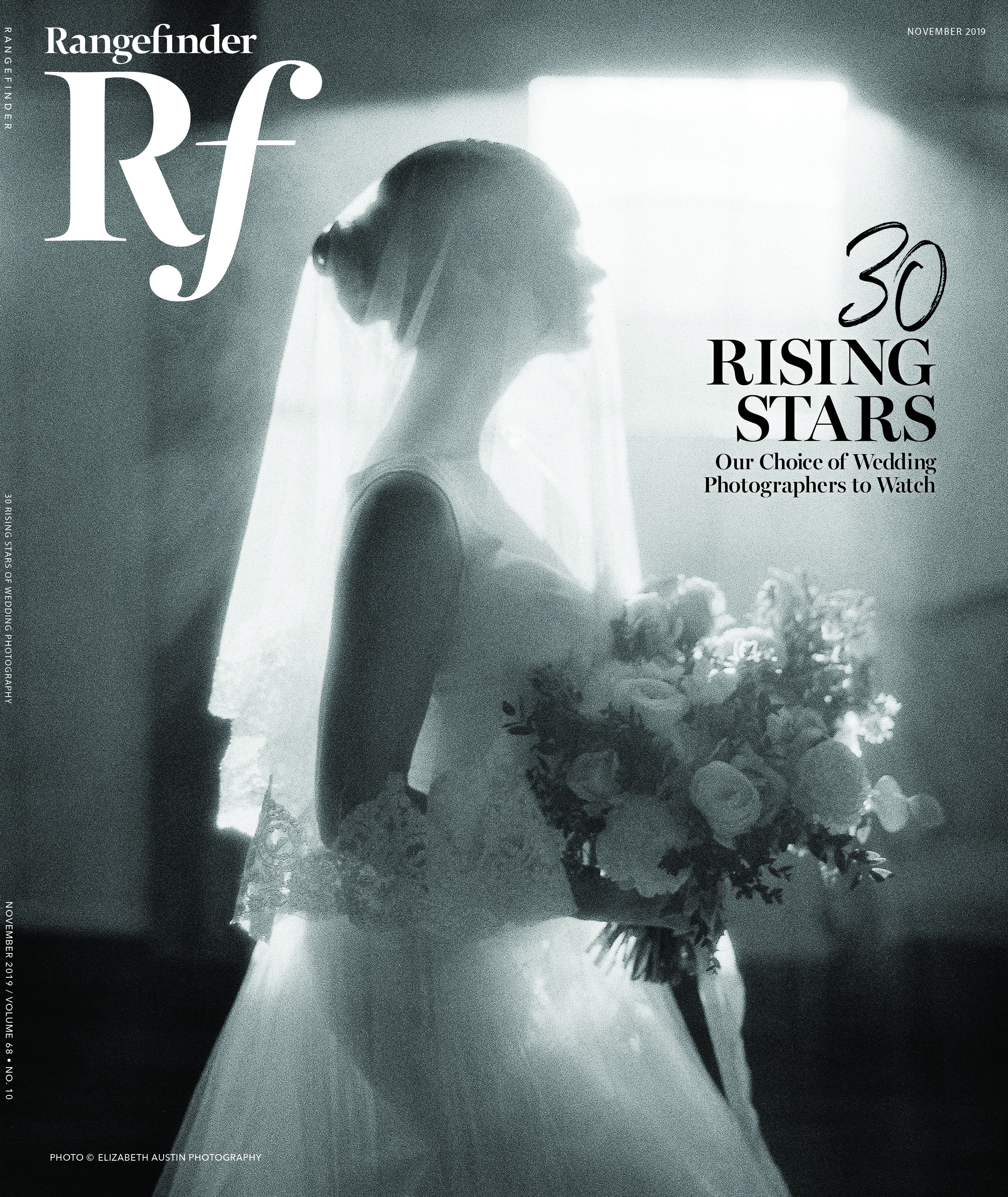
Tips + Techniques
How to Adjust Your Images for Fine-Art Printmaking
May 17, 2018

Okay, so you retouched, edited, adjusted and tweaked your image after your capture and it looked perfect when viewed on your calibrated monitor. The problem: the final print is a bit disappointing. What went wrong?
Assuming you had a correctly calibrated workflow, everything should be in order, but our expectations and perceptions of the printed image can still be off if you don’t have an understanding of the way image tonality will translate to various paper types.
Paper types have a great impact on the visual perception of image tonality and color, and the ability to display them accurately. Papers fall into two distinct groups; “fine-art” matte finish papers and luster/gloss papers.

Figure 1
You may have already noticed that your prints on luster or glossy finish papers seem more “vibrant” and a closer match to what you view on the monitor; it has to do with the way light interacts with the surface of the paper. But if you are printing on fine-art papers (textured or smooth), you may have found that prints of particular types of images (such as figure 1, above) seem to lack the visual “impact” that you might want; what follows are tips for adjusting your file to improve that.

But first, we should understand the problem: matte papers display a lower maximum black, less shadow separation, less contrast, and less color saturation than luster/gloss papers. Depending on the image, this may be more or less evident; low-key/high-saturation images may appear “weak” or “muddy” on matte paper. figure 2 (above) shows a side-by-side comparison of the image printed on a luster paper versus on a matte fine-art paper. Medium- and high-key images tend not to display so much of a difference because mid-tone and highlight details are easier to reproduce (given a calibrated workflow).
Now that we understand where the weaknesses lie, we can concentrate on making adjustments in three specific areas: overall tonality, shadow detail/separation and saturation.

figure 3
Overall Tonality
The image on your monitor is produced by transmitted light, and as a result, it displays a very wide range of contrast. Rather than just trusting your visual perception of image tonality, be sure to look at the histogram to assess whether you are sending solid blacks and clean whites to the printer. figure 3 (above) shows the histogram for an image that
has no 100 percent blacks or whites, although it appeared adequate on the monitor; the print would have appeared weak in tonality.

figure 4

figure 5
figure 4 shows the adjustment needed and figure 5 (both above) shows the result.

figure 6
Shadow Detail/Separation
An excellent tool for enhancing shadow separation is Topaz Detail 3. figure 6 (above) shows the before and after, using the Shadow Relief III setting within the Shadow Detail Collection. It may be difficult to see the difference within the image, but the tonal scale at the bottom shows how the lowest tones have been boosted.

figure 7
Another method is to use a simple curves adjustment as seen in figure 7 (above), although not quite as effective as using Topaz Detail, in my opinion.

Saturation
There is more ink absorption with fine-art papers, so colors may appear slightly more muted in the final print than on luster papers. We can use a simple saturation adjustment to offset that. Try Hue and Saturation or Vibrance with values from +15 to +25, depending on the image. figure 8 (above)shows the result.
Closing Notes
Keep in mind that even with adjustments, prints on matte fine- art papers can only produce a certain level of maximum black, which will always be less than that of luster or glossy photo papers.
The final presentation as a wall art piece will add to the overall impact of the print. The use of white matting actually makes the blacks appear blacker, due to the adjacency effect. Framed fine-art prints need matting and glazing (either glass or acrylic) since the surface print is susceptible to scuffing.
Be sure to do your image editing on a high-quality, calibrated monitor in a controlled, low-light environment. Laptop screens have improved greatly over the years, and many can be calibrated, but their portability allows them to be easily removed from controlled conditions.
[Editor’s Note: images in this article may not display the same color, contrast and density as seen in the actual paper prints.]
Jonathan Penney is happy answer your questions: [email protected] or (631) 874-3409
jonathanpenney.com
framepreview.com
Related: 15 Inkjet Printers and Papers for Wedding and Portrait Photographers
How to Pick the Right Paper for Your Photo Prints
Related Articles

Why Felix Kunze Thinks We’ve Been Overcomplicating Lighting (And What He’s Doing About It)
July 24, 2025
When it comes to lighting in photography, most of us instinctively reach for soft, flattering light. We diffuse our flashes, shoot through umbrellas, and seek out cloudy days. But what if I told you that some of the most striking portraitYou know the moment: your subject is ready, you’ve got about five feet of space to work with, and the...
More »

How to Photograph Fireworks for Couples Portraits
October 24, 2024
Fireworks aren’t just for the Fourth of July! You’ll find them regularly at theme parks, sporting events, and maybe more surprisingly, at weddings. For the latter, fireworks offer photographers a wonderful opportunity to capture epic couples portraits with a truly unique backdrop. Of course, if you’re not familiar with how to photograph fireworks, there are some basic tips you’ll want...
More »

Why Top Photographers are Embracing Hard Light (And You Should, Too)
October 23, 2024
When it comes to lighting in photography, most of us instinctively reach for soft, flattering light. We diffuse our flashes, shoot through umbrellas, and seek out cloudy days. But what if I told you that some of the most striking portraits actually come from embracing hard light? That’s exactly what renowned photographer Roberto Valenzuela teaches in his groundbreaking new Dynamic...
More »