Power of Print
WPPI Prize Winners Dissect Their Print Choices
February 15, 2018
When it comes to a printed image, the right paper makes all the difference. Jonathan Penney, a master printmaker, knows paper choice can be a major deal-breaker. We asked nine photographers who submitted winning images to last year’s WPPI The Annual to discuss the thinking behind their prints, with commentary from Penney on what worked.
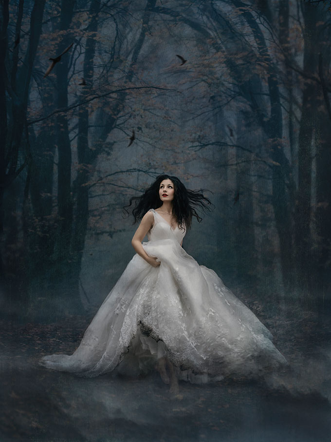
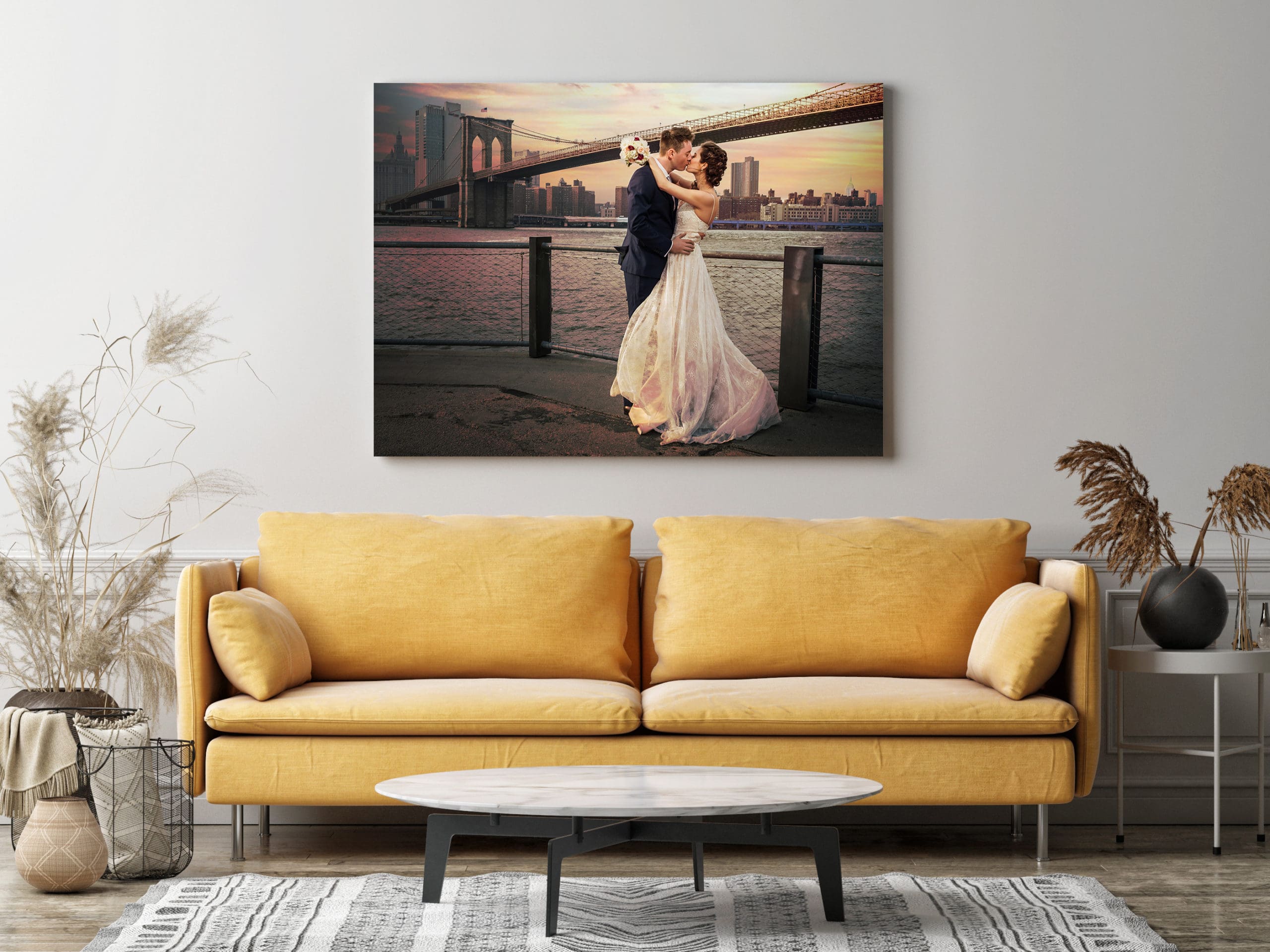
Photo © Sarah Ferrara
SARAH FERRARA
Print: “The Snow White Bride”
Paper: Graphistudio Canon Dreamlabo HD Fine Art
Award: First Place in Premiere
sarahferrara.com
This is a very smooth, matte fine-art paper, and the level of detail, especially in the shadows, was unlike anything I had seen before. I had studied some of the judging videos from previous years on the WPPI members website and knew that shadow detail and print quality were important.
This image was shot in very heavy fog in the woods behind my house, in dim light, with quite a high ISO. This gave it an otherworldly look that the deep blacks and shadow detail of the HD Fine Art paper would be perfect for. I knew the image would be examined under calibrated lights and didn’t want any reflections from the print or any gloss whatsoever.
Jonathan Penney says…
“This image has an overall softness in both color and tonality as well as an intimate quality. Smooth matte paper gives a softer rendition of this story than a glossy or luster paper would.”
Sarah’s Tip!
Study the winners’ galleries carefully—not to copy or imitate, but to understand the level of refinement. Attention to detail is extremely important, so don’t think the judges won’t notice something. Blown highlights and loss of detail in shadows might be acceptable or even fashionable elsewhere, but they are missteps in competition—unless done deliberately and with great expertise.
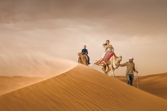
Photo © Sanjay Jogia From Eye Jogia Photography
SANJAY JOGIA
Print: “Desert Rose”
Paper: Hahnemühle Photo Rag Ultra Smooth
Award: Second Place in Engagement (Portrait Division)
eyejogia.com
I used this paper for its lack of texture, which suited this particular image because of the level of fine detail in the photograph, and because the paper is pure white so the color was reproduced in print exactly as I saw it on my monitor.
There was some discussion by the judges as to whether the camel handler should have been removed or not, which potentially cost me first place overall for the category, but it was a very subjective call. In hindsight, I might have reduced the slight magenta tint to the image, which comes with the warmth of the tones—the risk here, however, is that undesirable green hues are introduced, so it’s a fine balance.
Jonathan Penney says…
“This image has an atmospheric quality. The haziness of the sky and the blowing sand make it a good fit for the ‘soft’ feel of a smooth matte paper.”
Sanjay’s Tips!
1. Use an X-Rite ColorChecker Passport during capture to create color profiles for your camera.
2. Get a ViewSonic VP2768 monitor so that you are seeing the colors as they should be.
3. Print with a Canon PIXMA Pro-1 along with the correct paper profile for that printer so that the final output is as you see it on the screen.
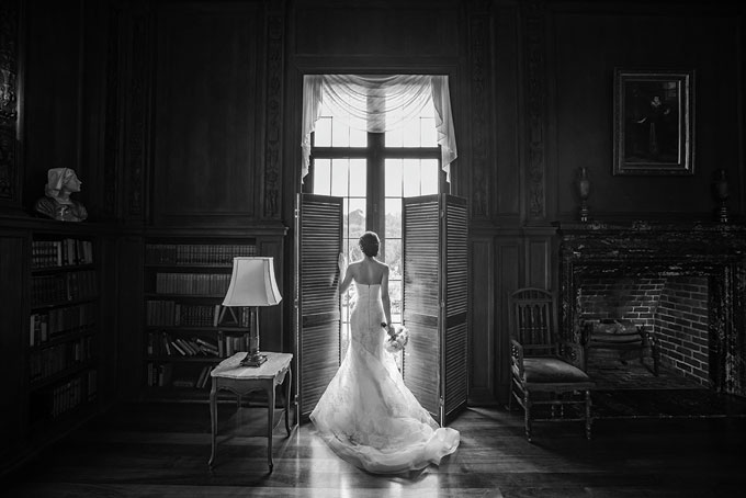
Photo © Danny Dong
DANNY DONG
Print: Untitled
Paper: Hahnemühle Photo Rag Matte Fine Art
Award: Second Place in Bride Alone: Wedding Day (Wedding Division)
dannydong.com
The smooth, fine-art cotton paper helped me get the soft, romantic mood for this portrait of a bride waiting for the ceremony to start. It felt like a good fit for this moment. Next time, I would be more careful about the position of the chair and the side table. As is, it’s kind of unbalanced in the picture. This is a candid capture, but if I had a chance to do it again, I would move the table more to the left.
Jonathan Penney says…
“Smooth matte paper was a good choice to carry the mood and story. Low-key images such as this can be a challenge for matte papers. Applying a filter such as Topaz Detail will boost separation in the shadows.”
Danny’s Tip!
Submit as many times as you can and attend the two-day live judging at WPPI. This is always my favorite part of the competition. I learned so much about details such as posing, lighting and editing through listening to the judges’ comments.

Photo © Kelly Tunney Photographer
KELLY TUNNEY
Print: Untitled
Paper: Canson Infinity Rag Photographique 310
Award: First Place in Wedding Contemporary (Creative Division)
kellytunney.com.au
I have used this paper stock for many years now. It’s generally a good fit for my more graphic images like this one—it’s very bright, colorful and fun! The paper is really smooth, made from 100 percent cotton, and I’ve always found it to be super consistent.
Jonathan Penney says…
“Kelly’s choice of smooth matte paper is ideal, picking up on the retro color palette and the texture of the circular mats. A textured paper would have been too strong for the tiny details, and a glossy paper would feel too slick and contemporary for the imagery.”
Kelly’s Tip!
If you’re new to submitting work, ask for help from someone you trust—not your mother, because she loves everything you do. Get honest feedback from a fresh set of eyes, someone who has been there before.
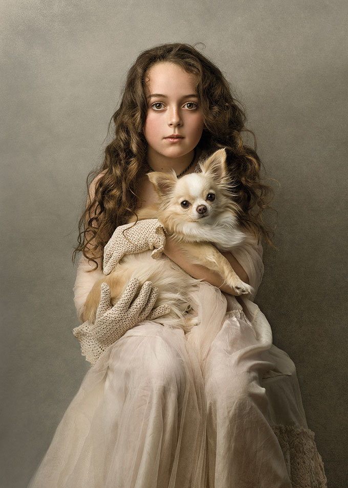
Photo © Vicky Papas Vergara
VICKY PAPAS VERGARA
Print: “Miss Mathilda and Daisy”
Paper: Ilford GALERIE Gold Fibre Gloss
Award: First Place in Children (Portrait Division)
vickypapas-vergara.com
I used this paper for its ability to reproduce fine detail and tonality. I find Ilford papers really make my images pop with amazing color rendition. It has beautiful transition between contrast, shadow detail and highlight areas. The look and feel of these papers offer my images a wonderful depth in print.
Since entering print competitions, l have given the task of printing my images to two very respected photographers in Australia: Rocco Ancora and Ian van der Wolde—l trust them with my babies (the prints). Exquisite printing and paper choice is a regular comment by judges, which always makes me happy to hear. I may want to experiment with a couple of textured papers in the future—that would be pretty cool!
Jonathan Penney says…
“Vicky’s choice of a semi-gloss Baryta paper provides deep blacks, crisp whites and excellent shadow separation for maximum impact under the competition lighting. An alternate rendering could be on a textured matte paper such as Canson Printmaking Rag 310, picking up on the image’s painterly quality.”
Vicky’s Tip!
Maintain a high standard throughout your workflow to achieve a print result without compromise. Choosing the right paper is no different from choosing your lighting, lens and editing tools. Understanding how to print will make you a better photographer; you’ll start to see your images in a more technical light and understand the nature of your work.
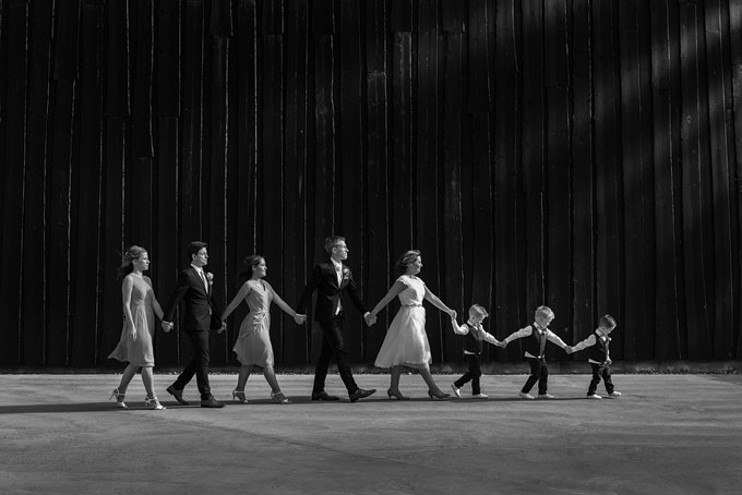
Photo © John Hellstrom
JOHN HELLSTROM
Print: “The Evolution of Family”
Paper: Canson Infinity Platine Fibre Rag
Award: Third Place in Bridal Party/Family and Friends (Wedding Division)
hellstrom.com
This was captured on a sunny summer day in Stockholm, Sweden, where I live. I imagined the bridal group walking against the light, with the contrast of the white bridal dress against the dark wooden wall. One of the children had just had a tantrum, and we were short of time as the other wedding guests were waiting for the group to come. The children were told a story by me to change focus, and I then asked them to stand first in line toward the light. Their mother and father were the bride and groom, standing behind them, and their groomsman and bridesmaids were last.
Judges don’t know this backstory—I primarily shoot for my clients. The third person from the left was the bride’s sister, and she wanted to be close to the wedding couple. If I had shot it only for the judges, I may have changed the place of the two bridesmaids to make the group more bell shaped.
The paper has a high Dmax (or “maximum density”), exceptional grey tones and a true, pure white tone without optical brighteners. It feels, to me, like a traditional darkroom paper.
Jonathan Penney says…
“A satin finish Baryta paper was the best choice to render the subtle shadow details and large range of tones in this image. Matte papers cannot provide the same deep blacks and would be too weak under the competition lighting.”
John’s Tip!
Shoot for good exposure from the start. Often that means using manual settings. It helps to have a camera that has a high dynamic range, especially in high-contrast scenes like this. I use the Nikon D850 that also lets me crop in if needed without losing quality.
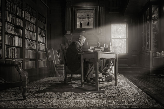
Photo © Cindy Harter Sims
CINDY HARTER SIMS
Print: “A Mighty Fortress”
Paper: Canson Infinity Rag Photographique 310
Award: Second Place in Group (Portrait Division)
cindyharterphotography.com
I have been able to learn about papers from master printer Jonathan Penney. I trust him to print my competition prints. This smooth matte paper was selected to match the tender, nostalgic mood of the story and the softly filtered lighting.
This is a portrait inspired by memories of my father and me, played by my granddaughter. I used to sit for hours under my father’s desk playing with my Curious George while my father prepared for his Sunday sermons. My granddaughter, Sky, was the perfect age to play me during that time of my life. It is an unusual experience to relive a childhood memory as an adult. Photography is such a beautiful medium that it allowed me to truly step inside that memory.
I chose a room that resembled his old study and moved the exact desk I used to sit under into that room. Each prop on the desk meant something to our story. I played hymns to get myself and my dad into the emotional space, and my granddaughter and I had a conversation about what this image meant to me, and she was proud to do a good job. I sat on the floor so that the perspective would be from Sky’s, or my view. The execution of this piece truly matched my vision, and the process was so meaningful.
Jonathan Penney says…
“The smooth matte finish and slight warmth of the paper is a perfect match for the mood and tonality of the image.”
Cindy’s Tip!
Tap into your own life and experiences for images. Take your eye and mind away from others’ work and look into what is only yours. The most unique material is found in your own life.
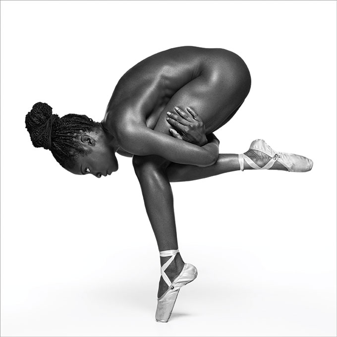
Photo © David Calvert
DAVID CALVERT
Print: Untitled
Paper: Harman by Hahnemühle Gloss Art Fibre Warmtone with matte finish
Award: Third Place in Boudoir (Portrait Division)
calvert.biz
I wanted a paper that was able to reproduce deep, rich, clear, punchy tones and detail on the dark greys and blacks. The texture isn’t too heavy, so you are able to see the texture of the subject’s skin.
I cannot stress enough how important it is to ensure that your submission is of the highest quality. I’ve attended open judging sessions in the UK, where the judges were presented with a fantastic image, but it was marked down because of the print quality. Banding, unintentional color casts, bad or overdone retouching, poor cropping and bad presentation, and not complying with the rules came up with alarming regularity.
Jonathan Penney says…
“A glossy Baryta paper provides the needed shadow detail and deep blacks as well as a classic ‘darkroom’ black-and-white look for this image. The DMax of this paper affords maximum visual impact under the harsh competition lighting.”
David’s Tip!
Don’t be put off by a low score. Learn from the judges’ feedback and come back stronger the next year. You improve as a photographer and, subsequently, your client will get a better product—which you can charge a premium for.
Photo © Kelly Brown
KELLY BROWN
Print: Untitled
Paper: Harman by Hahnemühle Gloss Art Fibre
Award: Third Place in Children (Portrait Division)
littlepiecesphotography.com.au
I love the subtle texture and semi-gloss finish on this paper as it allows true whites and blacks. It’s also a heavyweight paper that reproduces the full gamut of colors in my photograph. This is one of my favorite photographs, and the fact that it’s of my daughter makes it even more special.
Jonathan Penney says…
“I would have chosen a smooth matte paper to render the subtle tonality and color, and carry the innocent, youthful feeling. The soft finish of the paper would fit well with the introspective mood.”
Kelly’s Tip!
Take the time to really develop and plan your concepts before shooting, and then when you’re ready to print, test a variety of paper stock to see which is best suited to your image.
Related: How Photographer’s Can Sell More Photo Prints
How To Make the Best Print From Your Photo File
Related Articles
Canson Infinity’s Baryta Photographique II Matt Paper
July 23, 2021
Canson Infinity expands its range of papers to include Baryta Photographique II Matt, a new unique digital darkroom paper.
More »
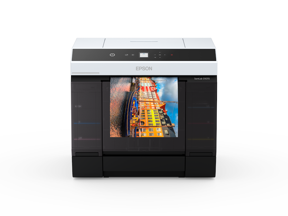
Epson’s New SureLab Printers: Great for Event Photography
July 22, 2021
Event photographers who need high speed, high volume print production have new options—Epson’s SureLab D1070 and D1070DE printers.
More »
Printing and Selling Wall Displays with CG Pro Prints
May 27, 2021
Photographer Aly Kuler and his wife, Kathleen Gemma Kuler, who are based in New York’s Hudson Valley, have been shooting weddings together ever since meeting at WPPI in 2019. “Everything was going great until the coronavirus pandemic hit,” says Aly, channeling not just other wedding photographers thoughts but small business people everywhere. Most of their clients postponed the big day,...
More »