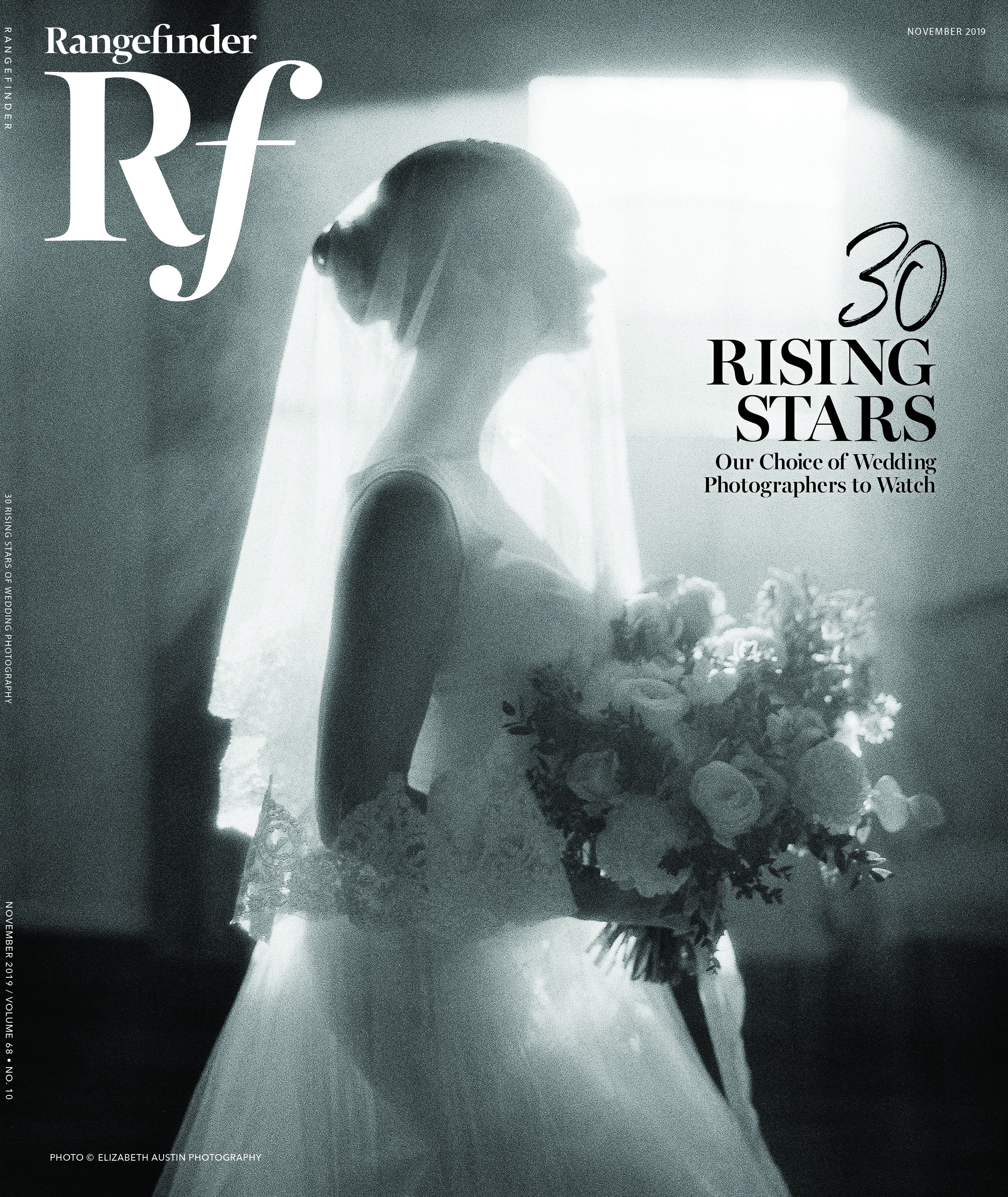
Power of Print
Advice From Master Printmaker Rocco Ancora
February 3, 2017
In the printmaking world, few photographers can claim the printmaking prowess that Rocco Ancora possesses. He’s certainly earned it; this is his 23rd year in the industry. His expertise was cultivated by years of work that began with an apprenticeship as a lab technician in the 1990s. Before anyone was fretting over color management, Ancora was mixing chemicals and learning to understand the multiplex facets of color. He printed many photographers’ work before he picked up a camera himself. Today, Ancora’s reputation as a highly respected photographer is met with accolades awarded from around the world, and he operates his own lab, Capture to Print, in his home base of Melbourne, Australia.
“I saw print fade to almost nothing over the years as digital took over,” Ancora says. “The USB stick became print’s replacement, which was really sad. But there’s absolutely been a resurgence. At least for me, if it’s not printed, it’s not real.”
Despite the upswing in print, a tepid mindset remains for some photographers in regards to printing. “It’s the fear of the unknown,” Ancora postulates, “the fear of color management and how color can be translated from a digital file onto a printed image.” He began with the color management side of the process back when Capture to Print went digital in 2000. “Understanding color was the biggest part of our success.”
DECODING THE PROCESS
1. Open up your color-checking toolbox.
“Look at tools that will help retain good color or color balance to a neutral color,” Ancora advises, like the X-Rite ColorChecker. “I can photograph the target, and pull it up into something like Adobe Lightroom or Camera Raw, click onto a neutral point and get perfect calibration every time.”
2. Know that not all monitors are created equal.
“When choosing a monitor, find out what contrast range it can display, the ideal being 1000:1,” Ancora says, and whether it can show the full spectrum within the Adobe RGB color space. “Monitors are calibrated to a standard, ISO 3664, using a device that attaches to your monitor and is controlled by dedicated software. I use the X-Rite i1 and the X-Rite ColorMunki.” From there, Ancora’s settings are White point D65 (6500k), Brightness 100-150 cdm2 (though this depends on the brightness of a working environment) and Gamma 2.2.
3. Go big on your color space.
Ancora likens color spaces to differently sized boxes of colored pencils. “Most photographers choose to work in sRGB, which is a relatively small color space compared to Adobe RGB or ProPhoto RGB,” he notes. “The raw files captured by your camera contain far more color than sRGB. In today’s fine-art printing world, some printers with custom profiles are even able to print bigger than the Adobe RGB color space.”
4. Start with 16 bits.
“If we begin with a 16-bit image, we have 65,536 levels of information for each of the color channels, as opposed to 256 levels with an 8-bit image.” Ancora attributes the artifacting and banding he observes in some images to 8-bit files that were pushed too far in Photoshop. Compare the histograms of an 8-bit photo that’s been adjusted versus 16-bits; the former looks dodgy and incomplete compared to the 16-bit histogram, without gaps. “When all the editing is done and the 16-bit master file is saved, we can then convert to 8-bit for printing,” he says. “Photoshop, in the conversion, will select the optimum 256 levels of information to produce a smooth, continuous tone. The color values stay the same. The finer gradations between colors of a 16-bit image will be reduced, and they’re virtually impossible to be detected by the naked eye in the final print unless we were printing a mural-size fine-art HD print, in which case printing in the full 16-bit would be an advantage.”
5. Hit Print.
“Translate color onto the printed page through custom profiles on your printer—we print onto an Inkjet or Epson printer using archival papers,” Ancora says. “Canson papers are probably my preferred choice for their variety and their archival permanency.”
DON’T FORGET!
* Shoot raw files in the highest bit rate that your camera offers.
* Make as many tonal adjustments possible at the raw conversion stage (in Camera Raw, Lightroom, etc.)
* Size the image to the print required before applying output sharpening.
ASK YOUR PRINTMAKER…
Are you calibrated, and what screen are you using to view images?
“I’ve had photographers send me stuff where, when I pulled up their images on our monitors, there wasn’t enough shadow detail to print,” Ancora says. “That’ll lead to a phone call with the photographer, or sometimes we’ll tweak the photo and send it back for approval, only to hear that the photographer can’t see any shadow detail. But actually, no, they just don’t have a high enough quality monitor. We have to make sure that what you see on your screen is what I see on my screen.”
Can I have a printer profile?
In other words, you’ll want to know what the printer’s going to be using for paper so you can soft-proof your image. “If I send you a paper profile from my particular printer, and you load that into Photoshop, you can actually see exactly how those tones are going to be interpreted on the particular stock of paper that I’m printing on. This is an extremely important process if you’re not printing yourself and you’re sending stuff out.”
PLAYING MATCHMAKER WITH PAPER
How do you want your image to look? “Think about the destination first,” Ancora advises, “and then the medium to get us to that destination. The color of your image and the dynamic range might suit a particular stock of paper.”
Capture to Print works with a range of photographers, he notes, from wedding photographers looking to make prints for clients or competitions, to fine-art shooters who want collections printed for exhibitions. He knows a thing or two about paper—primarily, that paper choice isn’t willy-nilly.
“When you first start to print, you think, Well, this is the paper I love, and this is what I’m going to use to print every single image I ever shoot, and it’s not that simple,” Ancora says. “You have to understand that different papers do different things—they all interpret tones differently.” A master printer will be able to look at your image and, without any trial-and-error, judge the type of paper that should be used to get the best out of the shadows, mid-tones and highlights.
That said, if you’re a novice, some trial-and-error can do some good. “Printing is all about completing your vision as an artist, and different paper stocks will express your vision in a different way,” Ancora says. “Print the same image on a couple of differed stocks and see what looks best to you.”
Ancora sticks with three different Baryta papers: Canson Rag Photographique (a fine-art smooth matte), Canson Printmaking Rag (a slightly textured, warmer matte) and Canson Platine (a fibre base-coated stock). Why Baryta papers? “They provide an aesthetic and feel of the original F-Type darkroom fibre base papers with a true, pure white tone, without the use of optical brightening agents,” he says. “Another characteristic is their ability to produce extremely high Dmax (or rich blacks), wide gamuts, good contrast and nice sharpness, making them an ideal choice for black-and-white and color prints.”
PAPER OF CHOICE
Your paper should be…
* Archival. This means it will be acid-free and 100 percent cotton or rag based.
* Free from Optical Brightness Additives (OBA). Then your paper won’t yellow over time.
* Compliant with ISO 9706. This is an aging-resistant standard that ensures your paper will meet the requirement of galleries and museums.
Plus!
“For long-lasting results, prints should be printed with pigment inks using ICC profiles specific to the paper, printer and inks,” Ancora advises. “Profiles can be downloaded from paper manufacturers’ websites or can be custom-created for each individual printer and paper combination.”
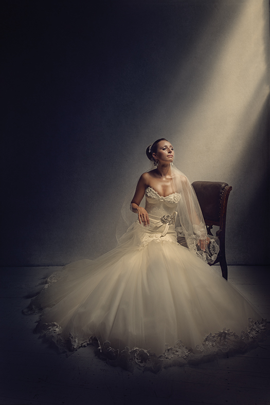
EVOLVING THE PRINT
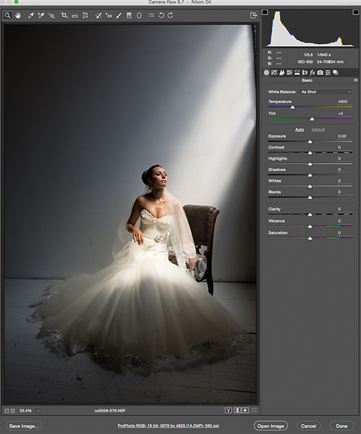
The image is imported into Adobe Camera Raw and necessary adjustments are made to color and tonality.
The image is exported into Photoshop in 16-bit in the ProPhoto RGB color space. “I usually like to map out the adjustments and brainstorm where I’d like the image to go and bring visual balance,” Ancora says.
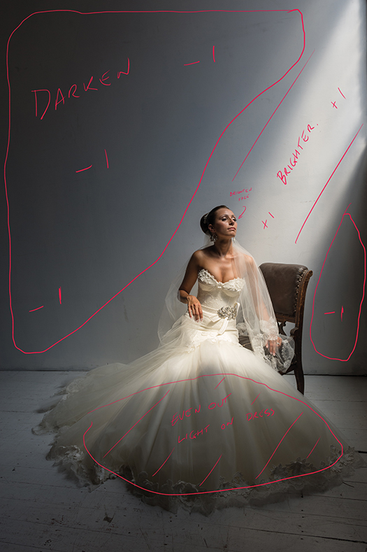
The final image is ready to print with all of the adjustments and color enhancements. “A texture was also added to the back wall to aid the overall look and feel,” Ancora says, who printed this on Canson Printmaking Rag paper. “The slightly warm base of the paper and subtle texture created the perfect finishing touch to complete the creative vision.”
PRINT COMP PREP
Look at the rules to find the intensity of lighting that the judges will use to view prints. “If you’re printing stuff yourself, set up an environment with that lighting intensity, which might be brighter than your household lighting,” Ancora says. “When you print (after calibrating your screen properly), you’ll see how those tones are interpreted.”
Color plays a major role as well, he says—it needs to be more than a supporting actor in a print. “If you enter a print and you try to do something funky with the color because you think it’s creative, but it adds nothing to the story and there’s no narrative that relates back to the color, the image is going to fail miserably,” Ancora cautions. “A lot of times you’ll see a photographer make a photo with a story about love and human connection, and then try to marry that up with a color that just doesn’t replicate that. You get a warm feeling but then a cold look, and you go, ‘This is not really working, this color is doing nothing for the message.’ You shouldn’t have to explain anything to the audience.”
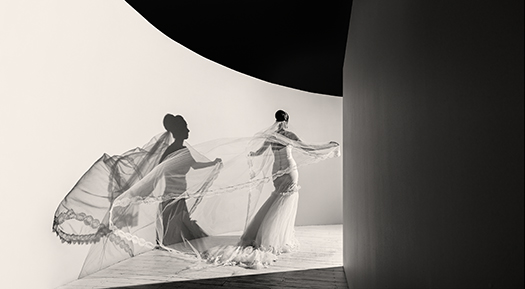
Rocco Ancora is an award-winning wedding photographer who’s celebrated for his classic, romantic work and meticulous printmaking. At WPPI, he will speak on the “Anatomy of a Fine-Art Print,” on Wednesday, February 8.
roccoancora.com
capturetoprint.com.au
To read this article in the digital edition, click here.
Related:
Why You Should Be Printing Your Work
The Everlasting Power of Print
Sign Up Today for Rocco’s CreativeLive Class: From Capture to Print
Related Articles
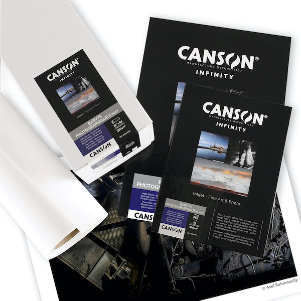
Canson Infinity’s Baryta Photographique II Matt Paper
July 23, 2021
Canson Infinity expands its range of papers to include Baryta Photographique II Matt, a new unique digital darkroom paper.
More »
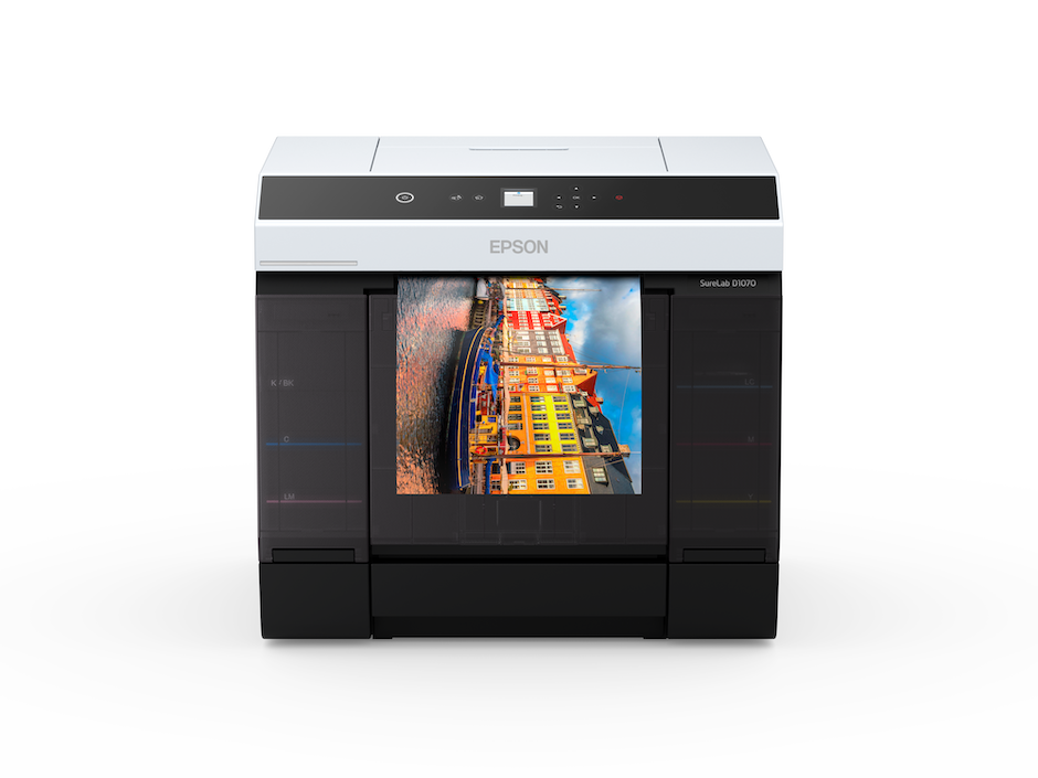
Epson’s New SureLab Printers: Great for Event Photography
July 22, 2021
Event photographers who need high speed, high volume print production have new options—Epson’s SureLab D1070 and D1070DE printers.
More »
Printing and Selling Wall Displays with CG Pro Prints
May 27, 2021
Photographer Aly Kuler and his wife, Kathleen Gemma Kuler, who are based in New York’s Hudson Valley, have been shooting weddings together ever since meeting at WPPI in 2019. “Everything was going great until the coronavirus pandemic hit,” says Aly, channeling not just other wedding photographers thoughts but small business people everywhere. Most of their clients postponed the big day,...
More »