Business + Marketing
13 Tips for Building a Photo Website that Attracts Clients
September 23, 2020

Recently, Julia Kelleher aired the segment Is Your Website Losing Potential Clients? on her business and marketing podcast, Focus & Facets. Every Tuesday she addresses topics that offer easy, actionable steps for listeners to walk away with. Below, she focuses on how you can build and maintain an impactful photo website that attracts the clients you want.
Your website is often the first thing a potential client sees when researching photographers or studios—it’s your business’ storefront window. Yet too many photographers neglect their website, citing not enough time to do it, or that they’re overwhelmed with organizing it. They put it on the back burner thinking they’ll get to it later.
Your website has to inspire potential clients to want to inquire. That’s its only job. It’s not to say that you love wild flowers, coffee and chocolate. It’s not to outline your pricing. It’s there for you to draw clients in. So don’t put off streamlining your business branding, updating your site or even creating one from scratch. It’s time to do the work and get it done, no matter how painful it might be. You will be amazed at the difference it can make.
[READ: 10 Tips to Make Your Photo Business Rank Higher With Solid SEO Tactics]


To get started, ask yourself these 13 questions and then utilize the corresponding tips:
1. Is your website dated?
If your template is something you picked out five years ago, then it’s dated. There’s much slicker technology out there and sites are so layered these days, as well as cleaner and more direct. If you are using an outdated template, you might want to think about upgrading. After all, who wants to hire a business that’s lost in the dark ages? There are many options out there; I personally like ShowIt. I switched from a WordPress account to my ShowIt account in part because I wanted that layered look on my website. Plus, ShowIt is so easy to design and user-friendly, and the load speeds were incredible (more on that in #10).
2. Is there contact information?
What town are you in? That’s just good for SEO. Is there a phone number and an email address to get a hold of you? I don’t necessarily want to have to fill out a contact form if I just have a quick question or I just want to make a quick phone call. Make sure you have contact info on your site. It’s a fast way to lose clients if you don’t.
3. Is there music on your site?
Lose it! That goes right along with being dated. Music is annoying. I will admit that the minute I go onto a site with music, I immediately click the music off. My anxiety is so high because the music is usually cheesy or some royalty-free thing that’s annoying. Get the music off your site. It’s not worth it. Nobody cares. Take it off and keep the focus on the visuals and on how people can contact you.
4. Are you hitting your ideal client’s pain points?
Are you addressing potential clients’ problems and needs, or is your website all about you and your business? When writing your copy and showing images, consider your audience—take into account what appeals to them and what they are looking for. Your website is not just a portfolio of work; it’s a way to prove to your potential client that you are the answer to their problems and the answer to their service needs.
For example, some clients may feel uncomfortable being photographed, or struggle with what to wear. Or they worry their kids own’t behave so they may not get good shots. Or they have no idea how to design a wall gallery and it intimidates them, so they don’t bother and just live with empty walls.
Knowing your clients’ pain points will help you evaluate what they want and then knowing what stops them, in their own mind, from getting booking a session can help you help them get past the blocks.
5. Is your brand cohesive?
So many times, I’ll see different colors on different pages, or the style of images is different on one page than on the other. They’ll even be different logos on one page versus the other or different fonts. Keep the brand cohesive! I want to make sure that every single page of my site looks like it’s the same business, the same colors, the same tonality, and if it has focal points. Images have focal points or centers of interest; your website’s pages should have that too. Make sure your brand is represented cohesively and flows uniformly across the entire site.

6. Is it easy to find information or is there a lot of clicking and buried info everywhere?
It should be easy to find things in multiple locations. If a client has to search and hunt and peck, that is too much effort on their part and they will click away.
7. Is your work up to date?
That’s along the lines of asking yourself if it’s dated, but this time I’m talking about your actual images. Are you showing a variety of sessions and a breadth of work that sticks to your style, but also shows the client that you can do a variety of work? And that your work is new and fresh? You may be doing that on your social accounts but it needs to be on your website, too. Try to update images monthly.
8. Is your site too wordy?
I can’t tell you the number of students I have out there who violate this one. To be successful, it has to be a scannable website, which means you can skim over it with your eyes and get what you need for information. You don’t have to put every single amount of info that’s ever been in your studio, including all your policies, on your website. Just don’t do it. All your website has to do is inspire the client to inquire.
Another question to ask is, are there too many fonts? Are you using script fonts or capital letters too much? Capital letters feel like someone’s screaming at you when you read that text, especially on body copy. Body copy should always be lower case. It should be written where it’s easy to read. Don’t do it in some Scriptina font. Instead, only use those decorative fonts very sparingly across your site, just as a headline or accents.
Fonts that work well online for body copy include Times New Roman, Arial, Cabin, Hind, Montserrat, Open Sans, Poppins, Cardo, Garamond, Quattrocento, Gills Sans, Avenir, Georgia and Geneva. (Certain fonts are becoming more outdated—I suggest that if you have to, use Papyrus, Trajan Pro, Scriptina, Windsong, Zapfino, or Comic Sans only extremely sparingly, if at all.)
9. Does your site look a lot like your competitors’ sites?
Does the brand feel the same? Are the pages the same? If you’ve done a SWOT analysis in your market and looked at your competitors’ sites, make sure your website doesn’t look like theirs. Even if it’s just a similar feeling, chances are you’re going to lose the client, especially if you’re higher priced than most competitors in the market.
One way around this is to really know yourself and your artistic style, and then be true to it in your brand. For example, are you funny and quirky in your work? If yes, then make your brand reflect that. Are you dark and mysterious? Let the brand speak to that with moody and rich imagery and accents. Are you light and cheerful? A brand that’s fresh, clean, white and modern may lend itself well here. Show what your competitors don’t have. Do you have a studio space and they don’t? Capitalize on that and show it. Do you composite incredible artistic, storybook pieces? Display it on your site with videos, BTS shots and before-and-after renderings.
10. Does your website load too slowly?
You can check the load speed by going on to some great speed generators. If you Google “website speed,” you will get a whole bunch of testing softwares that you can use. Just put in the name of your website and they will test how long it takes for your website to load. WordPress is notorious for being slow and, as I mentioned in #1, I switched from a WordPress account to my ShowIt account partially because the load speeds were incredible. My load speed at one point got up to 10 to 11 seconds on WordPress, and a lot of it was because I had images that just weren’t optimized for the site. Years and years of being on WordPress made everything slow down and sluggish. Now with ShowIt, my speed is incredibly fast. I absolutely love it and it keeps my clients. They’re eager to find more information.
11. Is your blog stale?
If the answer is yes, clients are going to look at it and go, “Oh, wait, this photographer hasn’t posted on their blog in like eight or nine months.” I struggled with this one, too. It’s hard to keep up with a blog, but do it. Even if you’re only posting once a month, at least you’re showing consistency in what you’re doing. You’re showing the client that you are a legit business that’s on top of things and is keeping up with things. That, my friend, is a big impression.
The decision to nix your blog entirely is a big one. Remember blogs are key for SEO. If you’re not going to have a blog, then you need to make alternative plans to continuously update and refresh your site for the Google bots. They want relevant content that is constantly up-to-date. A good rule of thumb is to post once a week. If you can’t do that, then do it once a month. The key is consistency.
12. Is your site mobile friendly?
Did you know that more than 65 percent of customers who are looking for a business online do it via their mobile device? Whether it be on an iPad, an iPhone or an Android device, your site needs to be responsive. Most dated websites and templates aren’t mobile friendly. You can’t view them in small format on a phone or on an iPad. Set yourself up with a mobile-responsive site. That’s going to be so important. You have to think of your mobile site as more important than your actual desktop site, because more people are searching for you on mobile than they are on desktop.
13. Are you capturing emails with a lead magnet and an email sequence?
A lead magnet is a free piece of content that you submit your email to, to get that content. Then you are subscribed to a business’s email list, where they can then follow up with you with an email sales sequence to sell a product to you, or just talk to you, for that matter. We can do that with our own clients.

As a newborn photographer, I send a lead magnet (above) to my clients that lays out what shots to get at the hospital with their iPhone. Most of my pregnant mommies are going into the hospital to have their baby and they want to capture those moments inside the hospital.
I have a lead magnet opt-in form on my website; check it out jewel-images.com. When a potential client submits her email to that, she gets a download that tells her the 10 gorgeous shots that she should not miss at the hospital when her new baby is born. That puts her onto my email sequence and from there, I can chat with her and talk to her about booking a session. I’m getting to her when she’s researching. I’m getting to her at month six, seven, eight and nine when she’s looking for a photographer, and when she’s nesting, and thinking about what she wants to do in her baby’s nursery.

Julia Kelleher is a Nikon Ambassador, WPPI speaker, international award-winning portrait and newborn photographer, and creative business educator in Bend, OR. Her podcast, Focus & Facets, airs weekly on Apple, Spotify and Stitcher. Kelleher is also the originator/creator of the 5 Carat Collective, an innovative, online business mastermind membership for photographers. Visit her website for more information.
Related Articles

Boost Your Sales Revenue and Turn Clients into Raving Fans and Referral Machines
April 24, 2024
If you’re tired of losing potential sales and want to know how to not just close deals but also keep your clients coming back for more, today, we’re diving deep into the power of sales in your portrait business. The Sales Journey It is a common misconception that sales are confined to the final ordering session. In reality, the sales...
More »

From Weddings to Senior Portraits: When Clients Return
March 28, 2024
Jihan Cerda is a stunning wedding photographer, who also happens to shoot engagements, maternity, newborns, families, and high school seniors. In fact, it’s no accident. Many of Cerda’s subjects are return clients who come to her for engagement shoots and stick with her through all the phases of their blossoming relationships and growing families. Cerda says, “There’s something about giving...
More »
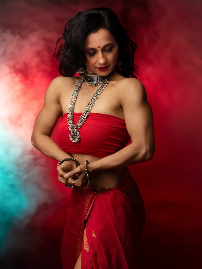
Goddesses Next Door: Empowering Everyday Women in India
March 20, 2024
That everyday women have goddesses within them is the radical notion that Bangalore, India, photographer Sudha Chandani Khatri makes evident in her portraiture of the women in her neighborhood. While glamour photography for everyday women has grown exponentially in popularity in the Western world, largely thanks to the work of portrait photography pioneer Sue Bryce and her mentees in The Portrait...
More »