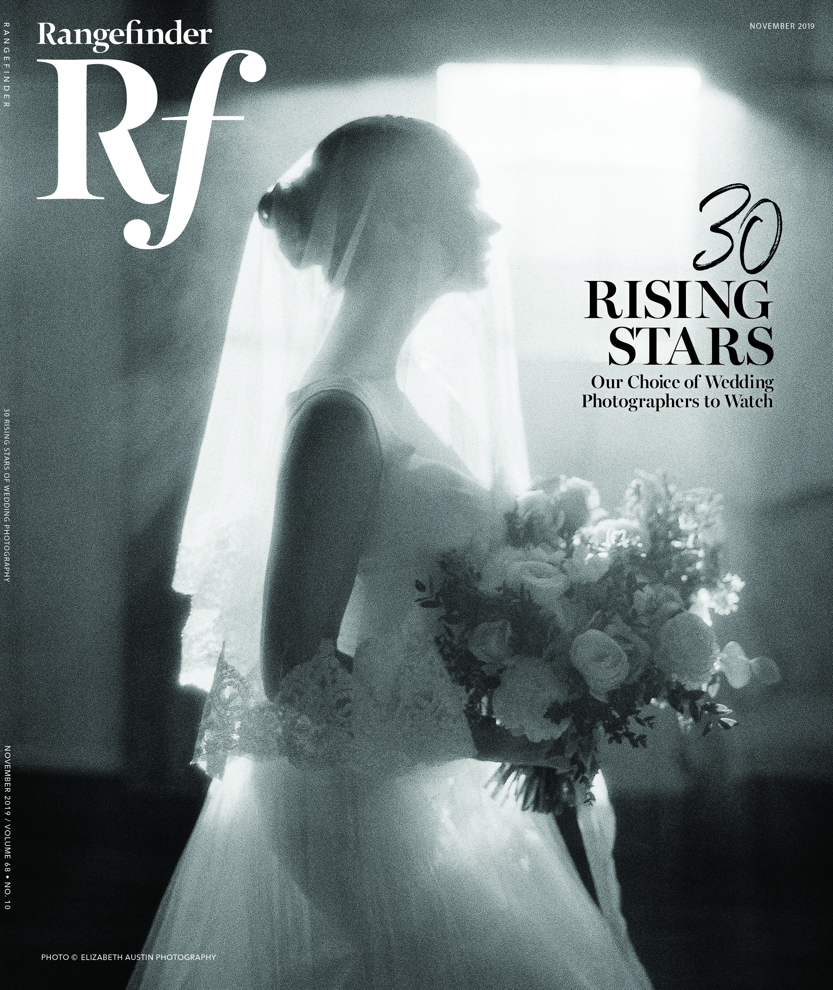
Weddings
Compare & Contrast: Breaking Down Two Editing Styles
May 31, 2017

We all know how important branding is for a photography business. One of the keys to that is being consistent in your editing style. At the moment, you may have noticed that there are more editing style options than you can shake a stick at, but if you really whittle it down to what’s trending—with bright and airy editorial, along with a plethora of others, lying somewhere in between—we feel the majority can be narrowed down into two camps: a vibrant and contrasty vs. vintage film look.
We have spent years flipping back and forth between these two styles. While we followed our hearts and started Green Tea Photography in the vibrant and contrasty look, we have realized that most photographers we hire to photograph us tend to be of the vintage film variety. We have found presets and filters that we love in that look, and yet when we are editing the photos that are dearest to our hearts, we’ve felt more connected with our vibrant and contrasty style.
The past few years have really had us going around in loops and seriously evaluating which direction we wanted to take our brand, until we made a recent decision that blew our minds.
But first, our subjective but significant “Which camp is the right one for you?” question. Let’s dive in to the elements you should consider.

The two different editing styles shown here—vintage film vs. vibrant and contrasty—affect the moods of your images, your editing time and much more.

LOOK AND FEEL
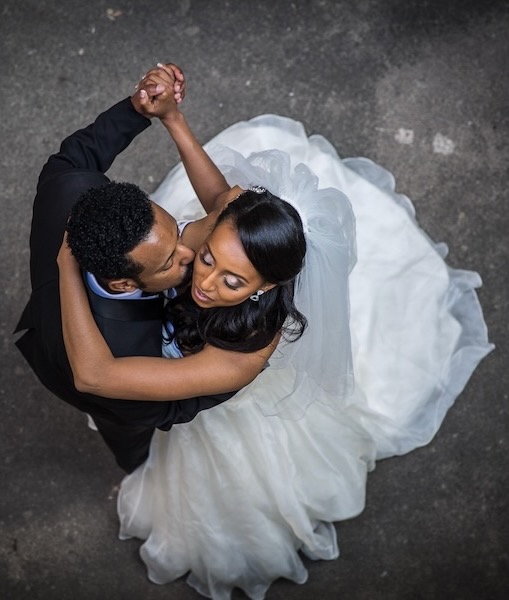
The biggest factor is choosing which style speaks to your heart. Vibrant and contrasty results in richly vivid images that tend to pop with bold colors that are truer to life in an “enhanced reality” kind of way.
Vibrant and contrasty results in richly vivid images that tend to pop with bold colors that are truer to life in an “enhanced reality” kind of way.Vintage film has a smooth, whimsical and romantic feel with colors that are muted and contrast that’s faded, often with added grain.
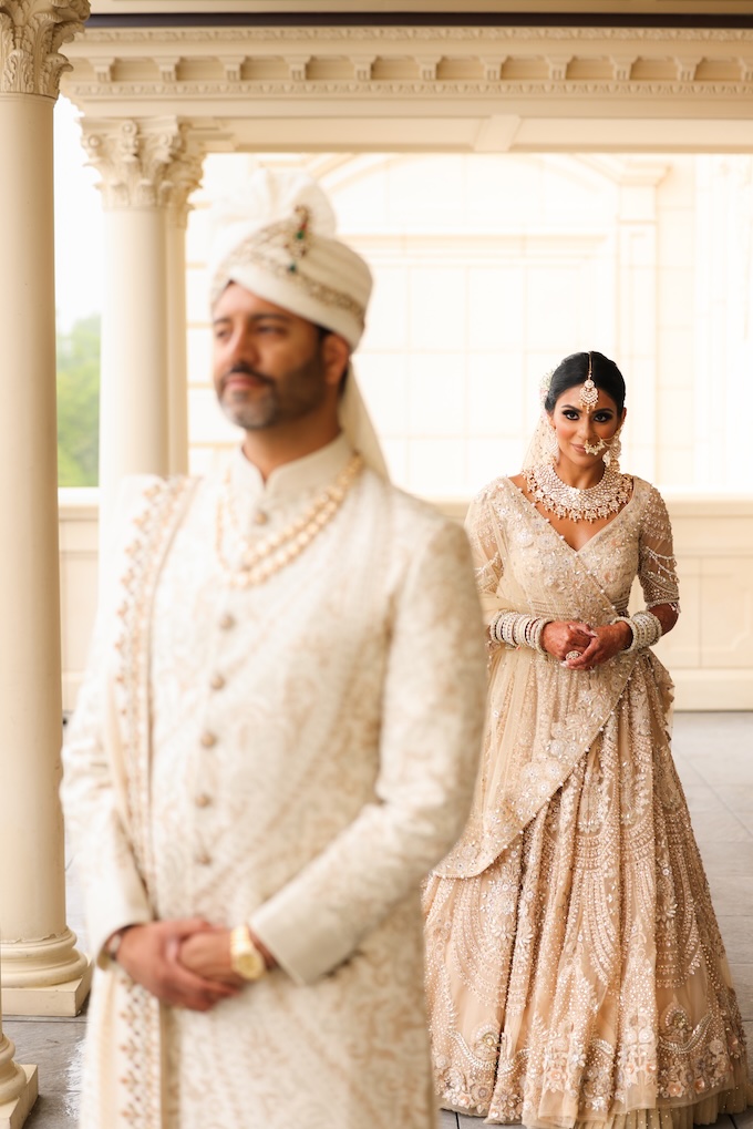
Vintage film has a smooth, whimsical and romantic feel with colors that are muted and contrast that’s faded, often with added grain.
EMOTIONAL IMPACT
This is the heart of an image.
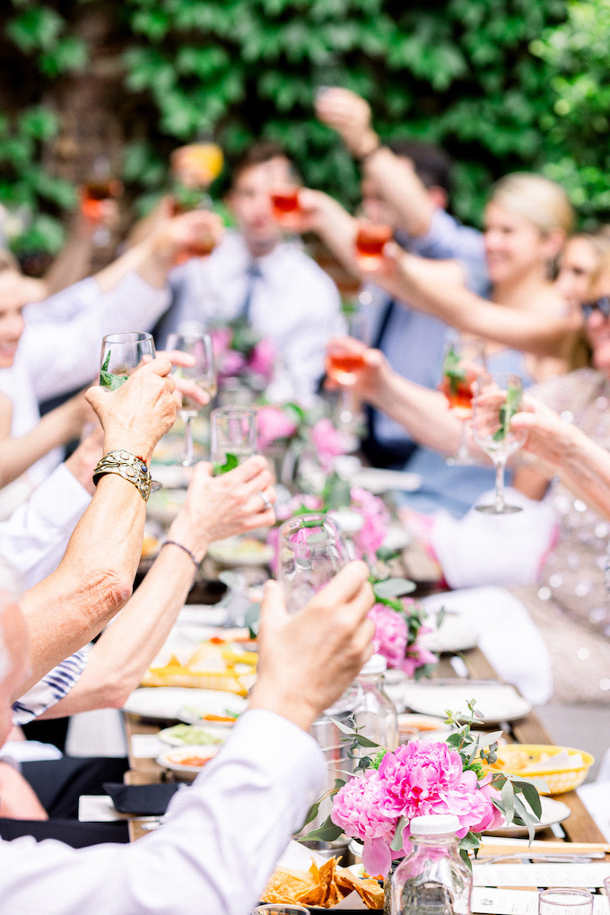
Vibrant and contrasty tends to be ideal for strong portrayals of action, from exuberant laughter and sobbing tears to crowd-surfing brides and drunken, stripped-down groomsmen.
Vintage film leans toward subtler and softer portrayals of love and emotion, such as cliffside portraits taken during golden hour or a hand shyly pushing hair to the side during a sweet interaction between a couple.
PROSPECTIVE CLIENT
While by no means a definitive list, there seems to be a theme between the two styles.
Vibrant and contrasty often attracts large, traditional as well as glitzier weddings, most popular with luxury-oriented clients who are likely to party hard and celebrate with their family and friends in a palace-style hall or on the deck of a yacht.
Vintage film usually draws outdoorsy world travelers who might be more into flower crowns than tiaras, intimate elopements on the edge of a mountain, or a sentimental backyard ceremony filled with DIY decorative touches and home-cooked food for a small group of friends and family.
RECOGNITION OF YOUR WORK
This is both important for putting food on the table as well as feeding our egos.
Vibrant and contrasty is usually better for photo competitions where a series of photos is not taken into account but rather images are viewed and judged on their own individual merit.
Vintage film seems to be preferred by blogs and publications that are looking for a consistency in look and feel as a whole.


SHOOTING STYLE
Approaches to light, compositions and moments can be very different.
Vibrant and contrasty composition and use of light need to be very clean and precise to look professional and purposeful. This can sometimes lead to images that look more rigid or possibly staged.
Vintage film composition and use of light can be used more loosely. Imperfections (which may be shot purposefully) can give a raw and organic feel to an image.
TIME AND DIFFICULTY EDITING
Oh, here is a big one.
Vibrant and contrasty can be more difficult to edit to make an image look good—and even more importantly, to not make an image look bad. Editing pushes out blacks, whites, shadows, highlights, vibrancy, saturation, contrast and clarity to the limits. Everything navigates a very fine line between having a flat image and one that pops—and one that’s overdone. What one person perceives as a perfect balance of vibrancy and contrast could also be seen as a cheesy swamp pile of neon no-ness. Think about it: If your whites are a touch too high? You blow out your highlights. If your blacks are too low? You’ll crush your shadows. The white balance has to be spot on for this style of editing or skin tones will look sickly. With the colors being pushed the way they are, be prepared to have to deal with the enhanced blue casts in shadows with multiple layers of brushes. Lots of tweaking and fine-tuning is needed, even with presets.
Vintage film, as compared to vibrant and contrasty, doesn’t necessarily require you to be as meticulous when it comes to adjustments. It’s often possible to make a professional-looking image with just the click of a button after customizing a preset to your liking. Whites, blacks, shadows and highlights are all brought to the middle, so you rarely have to worry about blown exposure or crushed shadows. Colors and contrast are toned down and muted so you don’t have to tread the very fine line between grass that pops and grass that looks radioactive. Grain is often welcome, and if the image doesn’t have perfectly crisp color values, it’s often for an artistic, emotional purpose.
CONSISTENCY OF IMAGES
Let’s talk about editing individual photos versus a series.
Vibrant and contrasty makes it almost impossible to get a common look and feel throughout an entire series of photos due to the very nature of this style. All elements of a photo and their differences are always being pushed to the extreme ends of the spectrum so a photo shot in strong, dynamic light will look totally different from a photo shot in diffused light—a photo with a warm colorcast from a tungsten light will look totally different from a photo with a cool colorcast from an overcast day. Individually, the photos can look spectacular, stand out and really pop, but in a series, it is much harder to get a common look and feel. This editing style pushes differences apart.
Vintage film, with its muted colors, faded contrast and middle-dwelling adjustments, is easier when it comes to achieving a more consistent look and feel. Dealing with diffused light in the morning and super bright, harsh sun in the afternoon can be editable to appear much more cohesive. With a less-than-accurate white balance being an artistic choice, you can lean everything toward the warm or cool side, and they can go together quite nicely. This editing style brings differences together.
So after all these considerations, which editing style did we choose?
Both.
We’ve recently decided to double-brand ourselves: Green Tea Photography for the vibrant and contrasty look, and Frosted Plum Studios for the vintage film look. We love and appreciate both of them too much to forego the other, and we wish to keep the style of our images consistent within their respective brand. Who knows where this next phase will bring us, but we’re excited to see which routes will steer us as our adventure continues.


The poppy colors are more subdued in the vintage film version (top), and the highlights are pulled down as well.
Note: There are insanely talented and ridiculously hardworking photographers in both camps who make every little decision with the utmost care and purpose that clients love. That said, if it seems like I’m implying that the vintage film look has the potential to be easier to edit than the vibrant and contrasty look, my answer is a resounding and respectful “yes.” I once did a test run after delivering a full wedding set to a client, and it took me about 30 hours to edit the wedding in our traditional vibrant and contrasty style. The vintage film look took me just a bit under three hours to get it to a point where I felt confident about sending it out; it also had a more consistent look and feel throughout.
Mathieu and Ann are an award-winning husband and wife photo duo based in Ottowa, Canada. They shoot weddings, engagements, lifestyle, family portraits and more under their dual brands, Green Tea Photography and Frosted Plum Studios.
Related:
CreativeLive Video Tutorial: Editing Habits to Break by Lesa Snider
A Handy Guide on Outsourcing Your Retouching
Shooting Urban Landscapes: Turning Grit to Glamour
Related Articles
Wedding Photography 101: Inside a Wedding Photographer’s Mind
March 7, 2024
Recently, I was speaking with one of my wedding photography assistants, and he was shocked at how much work and how many roles a wedding photographer plays on the day. It made me realize that many people don’t know what’s going on in a wedding photographer’s mind when we shoot. Many think we just have a fancy camera, nice lenses...
More »
First Look Wedding Photos: Capturing the Magic Before ‘I Do’
December 28, 2023
What’s a First Look? First looks are relatively private moments where the bride and groom get a “first look” at each other in their wedding attire before the actual ceremony takes place. It’s typically a very emotional moment for the couple and usually produces some breathtaking photos. Pictures aside, it just gives the couple a beautiful moment to share with...
More »
Micro Weddings Make it Big
August 2, 2023
If you know how to plan, price, and market for them, photographing micro weddings can be a huge pleasure. Micro weddings have always been with us. Even before 2020, some photographers were noticing the growing popularity of intimate gatherings with no more than 50 people or so, but pandemic restrictions fast-tracked the little-wedding trend into mainstream acceptability. For couples whose...
More »