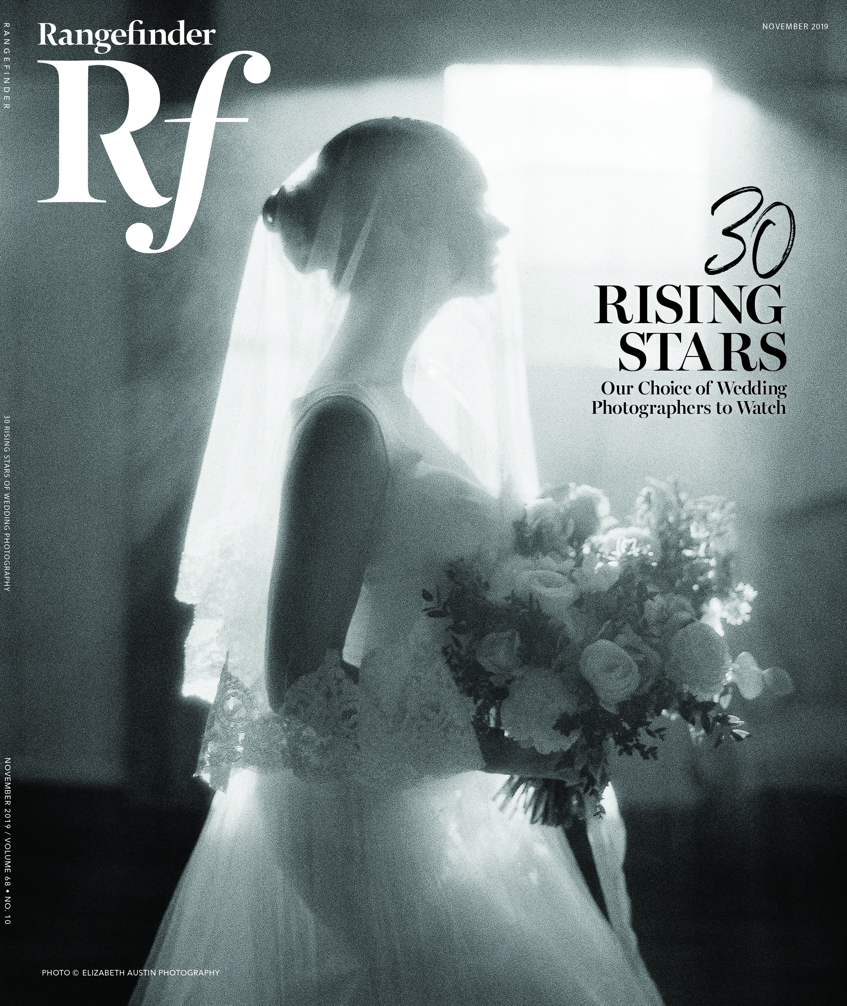
Beauty, Glamour + Fashion
A Beauty Photographer’s Secrets to Creating Narrative Concepts
March 29, 2019
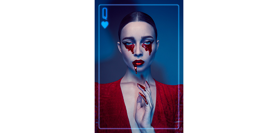
My “Queen of Hearts” portrait from a self-portraiture series called “House of Cards" is probably one of the most dramatic I’ve created. The frame gives out the concept away, but I also like the image without the frame.
How many times have you had a really good, creative idea that you wanted to photograph but you didn’t know where to begin? Maybe you did make some photos after you thought of it, but they didn’t turn out the way you wanted and the message you were trying to convey didn’t quite come across as you had hoped…
Here, I share my approach to a creative concept workflow that helps me—and will help you—get closer to making your ideas come to life.
It all starts with a thought. Something sparks inspiration inside of you, and you think, This is an amazing idea for a photo shoot! For me, that spark usually stems from some sort of feeling, event that happened or material. (Actually, I’ve noticed that materials inspire me a lot and I totally use them to my benefit in my commercial work.)
For my “Queen of Hearts” portrait (above), I first thought of traditional paintings of Orthodox saints. The Queen of Hearts to me seems very strong but also very loving, willing to sacrifice herself for others. I tried to reflect that in the posing and the red glittery tears. I wanted an expression that was ambiguous yet innocent. The hairstyle is very sleek and pulled back, which to me implies proper manners and perfectionism. And then, of course, there’s the color red. Rarely will someone see the photo exactly as I do, but the vibe is clear and the remaining ambiguity of the portrait will make them want to explore and impose their own story.
One time, I thought of photographing the idea of “opposites attract” or “unity in duality.” At first sight in my mind, it looked very vague, but as I thought of it more, I imagined fire and ice—two opposing elements that in my concept strive to unite. With this visual reference in mind, I probed to gather as many details about it as possible.

The first thing was the color—I knew I wanted ice to be blue and fire to be red. I imagined male and female models in the photo, and I chose to make the female represent fire because I wanted to portray her as dangerous and alluring. This, in turn, determined my posing. I wanted the female model to hold the male model’s face as a sign of control, seduction and magnetism. I wanted ice to be charmed by fire, and that was reflected in the posing as well. He is craning towards her; she looks weightless.
I wanted to stress the “fire and ice” concept even more by using glitter with the corresponding colors. Fire shimmers and burns, as does ice, due to its structure. To amp this up further, I used the hair as a tool: ice was swept back and still while fire was flowing upward to represent flames.
I refrained from adding flames or icicles in post-production. I wanted the concept to remain an implication. Viewers may not be able to “read” it right away, but this forms a sort of ambiguity, which I treasure the most. The more ambiguous the work becomes, the more it connects with an audience. Viewers catch hints but interpret broader messages as they please. The work resonates with them in a very specific way, only understandable to them. I consider this a success.
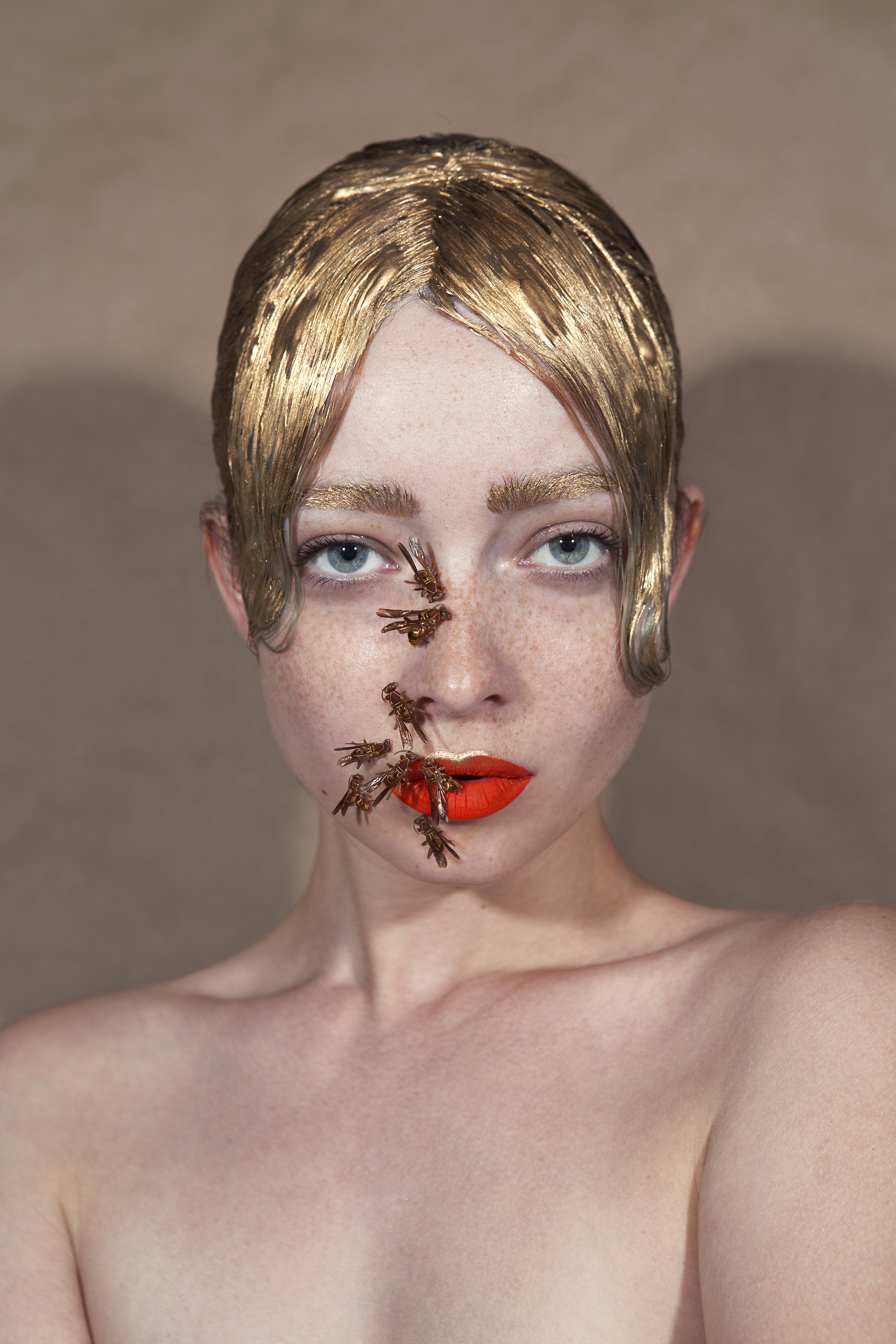
One of my favorite self-portraits is of wasps sitting on my face. I saw a dead wasp on the side of the road when I thought of this concept.
I glued it to my face in various areas, photographed each and merged them into one image in post-production. That photo sparked a lot of conversation with viewers—people interpreted it differently, but absolutely everybody felt uncomfortable when they saw the image.
People associate wasps with unpredictability and danger. I used this as a storytelling instrument. The fact that it appeared as though multiple wasps were able to “land” on a human body, especially on the face, conveys that the model represents a fearless character; she is in tune with danger and controls the situation. But we also know that wasps are attracted to sweetness. The photo can be interpreted in a variety of ways.

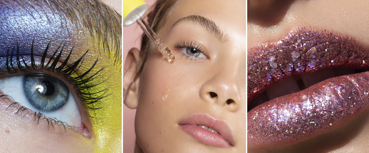
The photo above, “Phantom,” was photographed for a glitter brand’s campaign. The goal here was to demonstrate glitter eye shadow, but the concept was to portray a mystical ghost.
The client picked the photography approach—they wanted a long exposure to make the eye shadow look impactful. I suggested using pale lipstick and a fair complexion to resemble a ghost. I also thought it would be beneficial to add a cyan tint to the entire image, emphasizing Hollywood’s idea of a ghost cliché.
The image is slightly underexposed, which implies that the portrait comes out of the dark or dissolves. The dark eye shadow contributed to the look and made the bright eye color stand out even more—almost in a creepy way. The last detail added was movement in the hair, which helped create a floating effect.
7 TIPS TO BRINGING YOUR CONCEPT TO FRUITION
Nowadays, I feel comfortable keeping my mood board in my mind, but for someone who is just starting to shoot their creative concepts, that may be overwhelming. Here are my tips to planning your shoots by using a mood board on paper or in digital form:
1. Write down your concept. Formulate it and put in writing.
2. Write down all of the visual references that come to mind when you think of the concept. Look for similar references in art books, galleries, magazines or Pinterest. Place those that fit the most onto your mood board.
3. Write down all of the technical details such as your lighting setup, pose or crop. Look for references and add them to the board.
4. Pay attention to color and use it as a storytelling element. Plan on placing impactful color accents. Look for references that represent the color intensity and maybe even placement that you’re going for and add them to your board.
5. Remember that shapes and body language are very powerful. Give your models posing references at your shoot so you can make sure that they closely portray the message or characters with their expressions. Look for similar poses elsewhere and place the best references on the mood board.
6. Incorporate hair, makeup and props that you want to use to emphasize your idea. Add references to the mood board. Present your mood board complete with references for photography, posing, hair, makeup and wardrobe to your team, if you’re using one. This will help you communicate your idea, stay on track throughout the shoot and clarify a lot of details.
7. Look for references that are more abstract but portray the vibe of your concept. They should be less literal and more emotional. You can use abstract paintings, textures found in nature, fabric, visuals that embody an overall color palette and feel consistent with your concept.
Daryna Barykina is a beauty and fashion photographer currently residing in Florida. Clients—Covergirl, Kat Von D and Matrix, among others—seek her out for creative lighting concepts, use of color and high-end retouching.
RELATED LINKS
3 Ways to Light and Photograph Glittery Portraits
Related Articles
Tips and Tricks for Photo Session Wardrobe Mastery
March 5, 2024
Let’s cover a few wardrobe tips and tricks to master your wardrobe for photo sessions! These simple guidelines will help you nail the look of your wardrobe. In short, we will discuss (in no particular order) bits and bobs, wallets, watches and spectacles. 1. Watch H-to-T What is H-to-T? It stands for Head to Toe. Feet, bottoms, kneecaps (and certainly fingernails) have...
More »
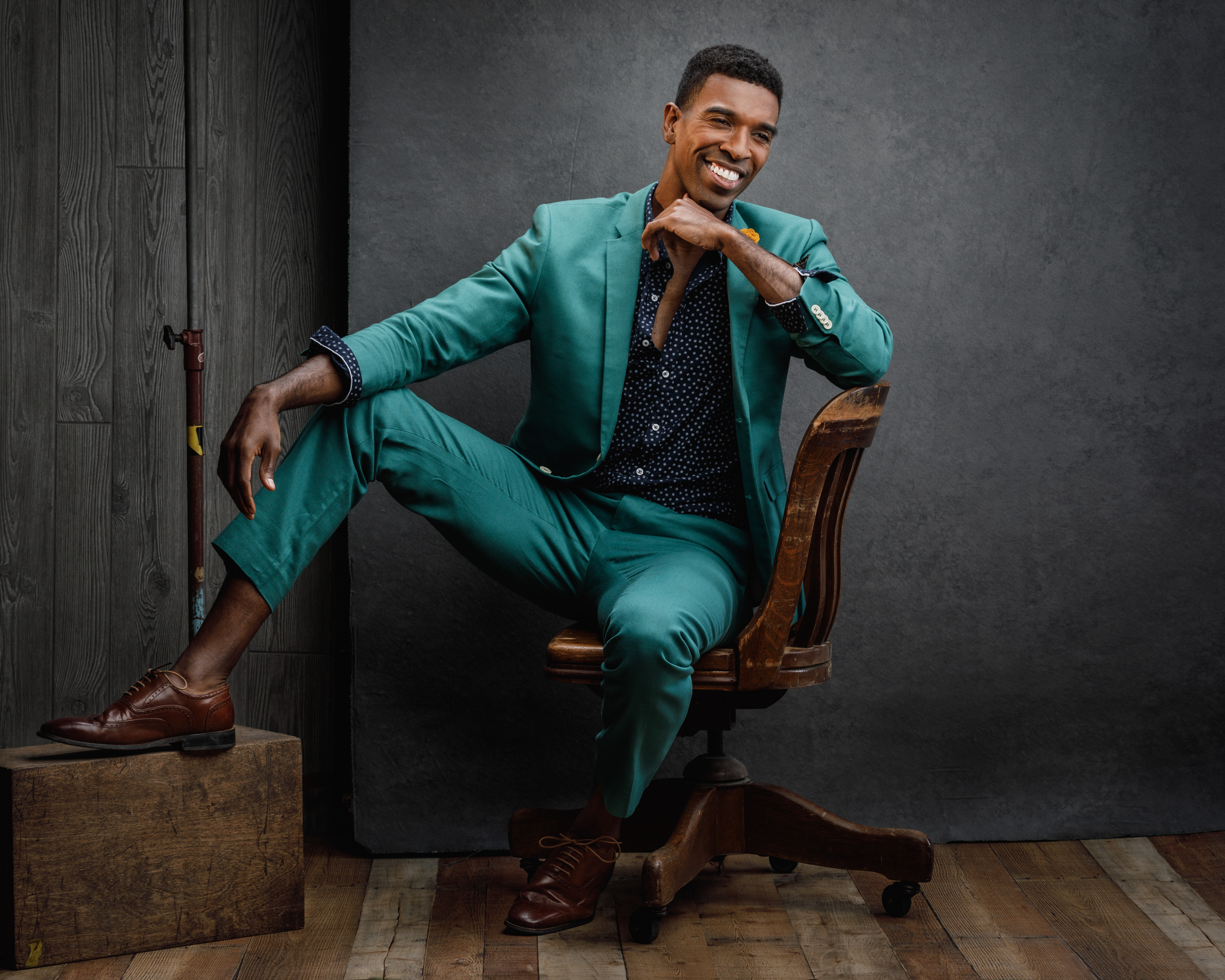
Photo Tips for Posing Men: The Only Time Manspreading is Okay
December 28, 2019
Posing can sometimes mean making subjects looks slimmer, but for men, you want them to dominate the frame. Here are some posing pointers.
More »
Changing Careers: From Scientist to Beauty Photographer
November 22, 2019
Did you ever notice Angela Marklew's bio says she used to test explosives for the Canadian government? We asked her to share her intriguing backstory.
More »