DIY Photo Studio Makeovers
September 9, 2013
Finding an affordable studio can be challenging. And whether you’re meeting potential clients or staging full-scale photo shoots, you want the space to be both functional and esthetically pleasing. We asked the photographers to share their tips for transforming a raw space into a working studio without breaking the bank.
Mineral Store Turned Family-Friendly Studio
Growing up behind the Iron Curtain in East Germany in the 1980s, Maria Hibbs spent much of her time looking through her grandmother’s box of old family photographs. Eventually, they inspired her to become a photographer herself—and to focus specifically on weddings and baby portraits.
After traveling the world to capture weddings in locations as far flung as China, India, Italy, Greece, Peru and Hawaii, Hibbs moved to Dallas, Texas, in 2005, to settle down with her husband Stephen and open her own studio. By chance, while searching for a house, they came upon an abandoned two-story building located just down the street from Stephen’s office. Once a mineral store, it had been abandoned for five years because of a fire that had left the structure a shell without windows or interior walls. It was a blank slate just begging to be transformed.
Maria and Stephen decided to buy the building. “It still was a great deal compared to getting a house somewhere and renting a studio space somewhere else,” she explains.
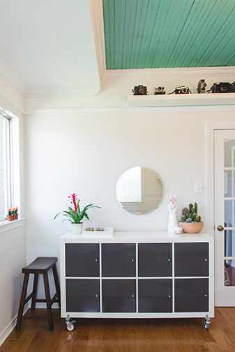
They turned the bottom floor into a studio, and the top floor into a living loft. “It’s basically just an open floor plan, kind of like a storefront,” she says. The space is lit naturally thanks to large windows at the front of the building. To get the studio ready for clients, Hibbs painted the walls white, and then filled them with prints of her photographs. On one side rested her children’s portraits on slender ledges; on the other, wedding pictures in antique frames that she painted white. “It was really important to match the studio to my brand,” she explains. “I’ve always been very drawn to modern themes in both my work and my personal life. When clients enter the space, it matches what they expect to see.”
The colors that Hibbs associates with her brand were once yellow, orange and turquoise; now, they’re antique rose and mint. The studio has a combination of all five. To stay within that theme, she bought furniture at antique stores and Ikea, and spray-painted the pieces in her colors.
In the front of the studio, Hibbs has a meeting place where she greets clients and talks to them about themes. In that space, she installed Ikea chandeliers at different levels to create texture to the lighting. “Clients just come in, and hang out as if it’s a living room,” she says.
In the middle of the space, she has colorful backdrops installed against the walls, along with a number of simple props stored in a closet built on the back wall. “I really only shoot babies around six months old,” she says. “They arrive, they sit with their moms on the sofas and I start making funny faces. Then I get to shooting.”
The simplicity helps her stay on budget; the location makes her life easier. “I like living and working in the same space,” she says. “My husband and I can eat lunch together every day.”
Changing the Sheets for Boudoir
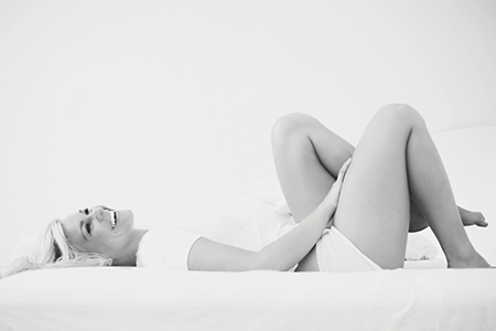
Lindsey Thorne, who graduated from the Savannah College of Art and Design in 2007, has always loved shooting fashion editorials. It was only natural that after college, she moved to New York to pursue a career in the fashion industry. Quickly, however, she became disenchanted with it; in her words, the fashion world “kicked her butt.” So she started working for a network of award-winning wedding photographers based in New York. Shooting for them, she discovered boudoir photography. “I realized that I could give my clients something a little more editorial than traditional wedding photography,” she says.
Thorne started offering boudoir photographs—sexy but elegant photographs of brides in lingerie before their weddings. Around 50 percent of the women wanted the photographs to give as gifts to their fiancé. The rest just wanted to document what their bodies looked like when they were in their 20s and 30s. “They want to feel like, ‘Damn, I look good,’” she says.
When she moved to Austin, Texas, to be closer to her sister and niece, Thorne began using the living room in her apartment as a studio. Pretty quickly, however, it became apparent that while the space was functional, it didn’t necessarily fit her esthetic. “My work is very clean, very editorial, very fashion-oriented,” she explains.
Thorne then began the hunt for a new apartment with her boudoir photographs in mind. Shooting for weddings trained her to find the natural light that was already in a room—white walls and big windows became a staple in her practice. “I like a white space because it gives me a clean palette,” she says. “My images are all about the woman, and not a big, gigantic antique chair around her.”
The apartment she settled on is replete with clean, simple details: aluminum doors, a spiral staircase and a huge window in the bedroom. Now she does the photo shoots in her own bed. “When I have a client coming in, I do a complete make-over of the space,” she says. “I have a different set of boudoir sheets, along with a number of props.” These props include mirrors, sheer curtains and a giant softbox, which she installs alongside the window. She uses a reflector to fill the light in the room.
Because she was using her own bedroom as a studio, she didn’t need to buy much to complete the space. Overall, the cost of putting it all together—including furniture, props, sample books, canvases and even a website—was roughly $2,500.
Before her clients come in, she does a consultation with them via email or phone. To give them inspiration, she sends them Pinterest boards with images of lingerie she likes from stores like Anthropologie. “If I never see a corset again, I’ll be happy,” she says.
Although she has nothing against male photographers, she usually has a female as her assistant the day of the shoot to make her clients feel comfortable. “People come to me because I’m a woman,” she says. “The experience is an escape for them—almost every client leaves feeling empowered. I think more women should do it.” She means both clients and photographers.
A Mid-Century Modern Parlour
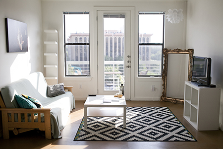
Apryl Ann, who is primarily a wedding photographer, does most of her work on location. And even though she doesn’t need a studio, she needs a place where she can meet clients. When her friend Alicia from Bows and Arrows—the official florist for the Bush family—contacted her about converting a 1930s home in Dallas into a one-stop-shop for wedding vendors, she was immediately interested. “We really liked each other’s styles,” says Apryl. “So we decided to collaborate.”
Half of the home was inhabited by the chiropractor who owned it. But the other half was turned into studios not only for Alicia and Apryl, but also for a wedding planner, a videographer, a cake-maker, a makeup artist, a DJ agent, a stylist and an invitation designer. The venue is known as “The Bell Jar.”
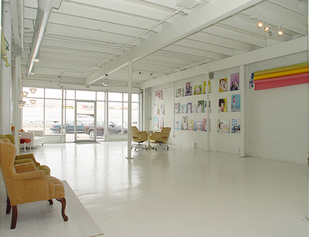
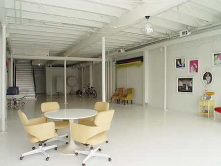
Originally, Apryl’s studio (a miniscule 120 square feet), was decorated by a local interior designer and friend, to fit with the esthetic of the rest of the studios. But although Apryl’s space—complete with a chandelier and deep purple drapes—was featured on Design*Sponge in 2012, she never felt like it fit her personal taste. “I’m more into clean design and Mid-Century Modern furniture,” she says. “The room felt a little cluttered to me.”
Because her husband owns a furniture rental company, which keeps many Mid-Century Modern pieces in stock, she already had a sense of what she was looking for. “I needed furniture that was big enough to fit a few clients, but wouldn’t overpower the room,” she says.
With the help of local design firm Neighborhood, she went to work re-decorating the studio. To keep the space open, she bought wire Eames chairs rather than solid ones; they created the illusion of transparency. For a coffee table, she put together two brass side tables from West Elm, which is one of her favorite stores. Although her heart was set on another West Elm table for showing her portfolio, she saved money by buying one from Ikea.
To bring together the space, she used carpet tiles from affordably-priced Flor, to create a rug. Rather than flowers, she filled the space with succulents from a local nursery. “Budget was a big consideration,” she says.
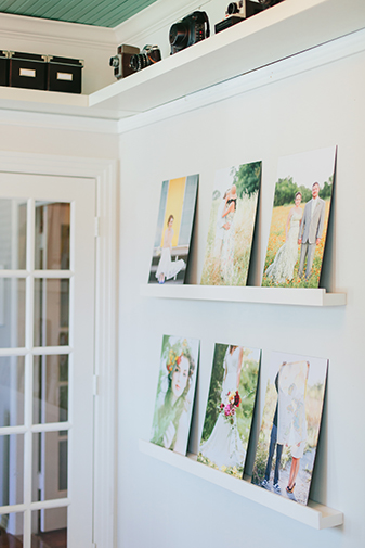
The simplicity of the design gives prominence to Apryl’s photographs, which hang on the walls. Because much of the space has windows, she had to be creative. “I just ordered normal-sized prints on a Styrene board,” she says. She propped the prints on thin picture shelves. She also considered layering them on pegs in a grid similar to the one that appears on Instagram when you click on a profile.
“I would recommend talking to people you know in the design world for tips,” she says. “I really networked around to find the best deals on everything.”
Perfect Studio Design
The partnership of wedding photographer Marc Anthony with artistic director/designer Tony Ryan, as Marc Anthony Photography, has been a successful one for the past ten years, mainly because the duo understood, from the start, their style—high-end fashion and glamor fused into storytelling narratives—and the clients it would attract.
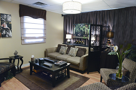
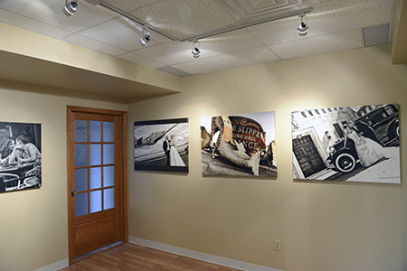
The second part of the success formula, however, lies in the look and comfort of their physical space where clients come to meet them and view their work. (From the beginning, Marc and Tony aspired to have a dynamic gallery and studio to showcase their talents. After ten years of perseverance, they achieved their goal.) Their current gallery in Ohio is their fifth updated space. Just six months ago, they were in a three-room, 800-square-foot space above a bridal shop for the past six years. Their screening room (above) is a good example of how the team managed to open up the room completely with lighting, fabric and a few strategically-placed room accessories.
“When potential clients walk up to your front entrance—your restroom, your hallways, your sitting or screening room…they’re all equally important spaces because that’s what people see when they come to meet you,” says Tony. “It’s important to try to put yourself in the clients’ shoes, to see what they see when they walk through your door.”
In fact, the pair feels that presentation is so important that they want to help other photographers streamline their own workplaces, whether it’s a home studio or commercial space. They recently teamed with Simply Color Lab to produce a Webinar titled “Perfect Studio Design” showing how to design a creatively-inspired home studio or gallery space photographers and their clients will love.
Some of their tips?
• If you hang images on a wall, make them all at eye-level. So, take the height of each picture, whether it’s a vertical or horizontal, and then put the center slightly above eye level on the wall so that all the centered points of each photo are on the same level. This gives an illusion of a straight, even line and also helps lend a gallery presentation to the images.
• If you have a TV screen mounted over a fireplace or wall, have a slide- show of your work playing as clients walk in.
• If you have a spare bedroom, empty it out and create a screening room. To go a bit more extreme, if it’s a room you never use, think about widening the doorway and adding track lighting on the ceiling.
• Consider different mediums on which you print your images, including wood and metal, and in different shapes and sizes. An unusual panoramic size, custom fit into a certain space, makes for a very impressive presentation.
• A coffee table is a must in any room: not only do guests have a place to rest their drinks, but it serves as an excellent place to display your albums. RF
Related Articles

In One’s Own Skin: Beautifully Real Self Portraits
April 17, 2024
I’ve long felt disenchanted with the contrived. I suppose that’s why I took a bit of time away from self portraits. It’s more challenging to capture something natural, authentic, and less curated when first you have to set up your camera, establish your camera settings, and get into place. Recognizing that self portraits have always been the catalyst for evolution...
More »

Master Natural Light Photography with Nikki Closser
April 11, 2024
When you master natural light, you can create amazing images in virtually any lighting scenario Mother Nature sends your way. In her portrait photography career of ten plus years, Nikki Closser has found that using the natural light of the sun is the easiest and most efficient way to create warm and authentic portraits, and she shoots 90% of her...
More »

Five Boudoir Photography Myths Busted!
April 9, 2024
There seem to be many myths pertaining to boudoir photography, and unfortunately, these myths prevent many women from participating in this amazing experience! Let’s go ahead and bust five of the biggest myths that clients have, so you can ease their fears if you find them being hesitant. 1. I Have to Be Naked It doesn’t matter if someone is...
More »