Business + Marketing
What Does It Really Take to Create and Sell Your Own Photo Presets?
May 11, 2018

WLE Color1 renders reds and pinks a little more orange, and greens have less yellow and more blue, Ryan and Jill McGrath say. It has more contrast as well while bringing back detail in the highlights. With a nice transition from blacks to whites, it smooths out colors so that the duo doesn’t have to go in and do it with a brush.
Having unlocked the doors to their artistic voices, some preset creators are selling the keys to other photographers who seek a shortcut to self-discovery. Here are some lessons learned along the way.

Jacob Loafman
St. Louis, MO
@jacob_loafman
@mothpresets
jacobloafman.com

Ryan + Jillian McGrath | With Love & Embers
Annville, PA
@withloveandembers
withloveandembers.com
On Finding Their Signature Styles

For “Racquetball,” a personal project shot from last year, Jacob Loafman used his Moth Portrait-3C preset, one that’s meant to evoke a painterly feel with smooth tones and saturated colors. Photo © Jacob Loafman
Jacob Loafman: I’ve always enjoyed the colors of old film snapshots that my mother kept in giant boxes. I loved looking through those photographs, and now, as a photographer, I look back at them and pay attention to the tonal range, colors, shadows and grain. I love the grit and rawness. They add a certain feeling to the photograph, no matter the content.
Having been in business for a few years now, I’ve noticed that my style is evolving, as it should, and it takes cues from whatever the shoot. For a wedding with vintage decor, I edit with low contrast, a flat overall tone, muted highlights, with just a little pop of color. For a more modern wedding, I may go for a cleaner look: mid-contrast and brighter whites. For personal projects, I style around a color scheme, every time. As someone influenced by cinema, I realized that color scheme plays a huge role in the film’s overall feel, so I edit based on the color scheme I choose, which most of the time is a mix between my vintage edits, flat tones and muted highlights, with vibrant colors to get that pop just right.

We use WLE Color2 to cool down the shadows in our images, with a slight pink tone, muted highlights and deep blacks. When we’re photographing at places like Banff National Park or Emerald Lake in Yoho National Park, this preset helps amplify the beautiful blue tones in the water, without making anything feel overdone or fake. Photos © With Love & Embers
Ryan + Jillian McGrath: To be completely honest, trying to find our voice visually and convey the look and feeling we wanted was a struggle at first, and editing was probably one of the most difficult parts of being photographers during the first few years. We have always been drawn to richer colors, more contrast, deep blacks and an underlying warmth that easily plays off of the cool tones captured in the winter or during blue hour.
We mostly photograph on the East Coast, and in the summer, when we find ourselves in the woods, the colors often project a massive green cast on our subjects. We dove into Lightroom and worked to find a way to use the HSL panel and the camera calibration area to help tone down those greens and alter them to be more visually appealing. We used this same process to adjust skin tones, having discovered that we could isolate individual colors and make them more flattering for every person and couple we worked with, no matter the lighting situation.
On Packaging A Variety Of Looks

For his series “Vienne, the Stewardess,” Loafman edited with his warm, grainy Moth Portrait-2C preset and his “Blue Strawberry” split-toning tool, which adds blues to the highlights and reds to the shadows. Photo © Jacob Loafman
JL: I would receive lots of messages asking how I edited a particular photograph or how I was able to get a certain “feel.” I realized that selling my presets was an avenue I should look into, so I released a set of presets a couple years ago, and this year, I revised the packs and came out with Moth Presets. I have four black-and-white presets that I’ve used over the years in my work, and I have eight color presets that I’ve categorized by film, wedding and portrait. I wanted to maintain my style while providing something for everyone, so some of the color presets are just a basic, film-like color punch and grain, while others change the colors in a wild way.

As our main black-and-white preset, WLE BW1 has more contrast—the highlights are brighter and the blacks are deeper. Photos © With Love & Embers
R+JM: Striving for a level of consistency in every photograph, we decided to create presets for two different situations. WLE Color1 is our main preset, the one we use for almost all of our work, and it carries a warmth that complements most of the places we shoot and the majority of skin tones. WLE Color2 is for those days that just have a cooler, more textural tone, particularly suited for winter weddings and any shoots that feature water. We always want our colors to be realistic, but we have our take on them. We also created two black-and-white presets—WLE BW1 for more contrast, and WLE BW2, which creates a softer transition from dark to light.
We never saw ourselves as photographers who would sell their presets to others; we were just creating the levels of tones, colors, and contrast that we felt completed our work and vision. But at a certain point, other photographers began asking us about our presets. Our goal with selling our presets was to help others find their visual voice when they were struggling to achieve a look and feeling. If we can help others learn and grow from our own past struggles with editing, we want to do that.
On Seeing Eye To Eye With Customers

Particularly useful for harsh light situations such as this one, Loafman turned to his Moth Film-2C preset for a lower contrast, semi-flat tone with some grain and a slight color pop. This one reminds Loafman of the old snapshots he’d look at as a kid. Photo © Jacob Loafman
JL: I think it’s important for people to know that my presets won’t work for all shooting styles, and that’s perfectly okay. I’ve received disappointed messages from customers before, and after looking at the work they sent me so I could see what they meant, it was clear that my presets just didn’t match with their style. It made sense to me why they didn’t enjoy them. I used to take it personally, but now I try my best to explain why they may not be working. It’s just the truth of the preset industry: They are a hard sell. Even with sample photographs edited with my presets, those photographs are still not a potential customer’s photographs.
I offer to edit their photographs before they make the purchase, which I feel is important, even though I do feel that the market for my style is narrow because the presets are a bit niche. I knew when I launched these presets that I would have to show a lot of before-and-after examples to give people a good idea of what they do, as well as create some tutorial videos, which are currently in the works. I also want to interact more with my market, so I created a Facebook group and an Instagram account dedicated to my Moth Presets.

WLE BW2 has blacks that are deep but faded a little, the whites are far more muted, the highlights are pulled down to retain more detail, and a bit of grain is added as well. Photo © With Love & Embers
R+JM: As we see it, anyone who purchases our presets gets our full support and an open door to email, call, Skype or FaceTime with us if they need help. We want to really do more than just sell people a preset. The answers to a lot of questions we get about coloring can be found in either the HSL panel’s red, orange and yellow hue section or the camera calibration section’s shadows and red primary. Those two areas, we discovered, are like a whole new world of editing and color control, and it is so amazing to see others have that aha moment and get excited to go edit.

Loafman chose to edit this couple’s portrait with Moth Wedding-1C, a mid-contrast preset with semi-warm tones and auburn yellows and greens. Image © Jacob Loafman
Advice for Preset Buyers
JL: Presets are meant to be a starting point. That’s exactly what they are. If you enjoy the look of another artist’s work and they sell presets, that is a wonderful thing, because they will provide a similar feel, but they won’t make your photographs looks exactly like that artist’s work. Different lighting situations, color schemes and even white balance play a huge part in their style. There are plenty of presets on the market right now that will provide a solid starting point—some even work in most situations—but they are just meant to enhance a photograph with a fresh breath of tones and colors. They do not save a photograph shot in terrible lighting conditions.

WLE Color1 renders reds and pinks a little more orange, and greens have less yellow and more blue. It’s also pretty contrasty while bringing back detail in the highlights. It creates a nice transition from blacks to whites—a sort of smoothening effect that no longer requires us to have to go in and smooth an image with a brush. Image © With Love & Embers
R+JM: Explore the depths of your editing software. Isolating each section and pulling the sliders from one extreme to another, putting points on your tone curve and dragging them all around and looking into the camera calibration section will give you a good sense of what you are able to do. Build knowledge of what others are doing and the editing styles that are relevant right now, but resist the need to recreate them. Listen to that little artistic voice that helps you create the amazing work you are already producing and focus on it. Always find your way back to who you are as an artist, what makes your work special and unique to you.
The Future of Presets
Begun last year by renowned wedding and portrait photographer Jeff Newsom and Ken Liu, former owner of Renaissance Albums, DVLOP aims to fix some of the downsides associated with purchasing presets by offering a new model and a collection of presets from various acclaimed photographers, including Fer Juaristi, Susan Stripling, Jide Alakija, Jonas Peterson, Samm Blake and Newsom himself.
DVLOP automatically picks up and translates camera types and equalizes files, bypassing the historical issue of applying presets from a photographer that shoots with a different brand of gear. This is particularly good news for photographers with second shooters or people shooting with multiple systems, according to Liu, and it winds up saving a lot of time.
Unique to the DVLOP system, customers can also mix different processing components from multiple DVLOP photographers, which means there’s more opportunity to explore and discover an original look. “It allows for a lot of creative play,” Liu says. “You can reach that moment of, ‘This is the editing cocktail I’ve been looking for that I haven’t been able to find.’ ”
DVLOP’s goal is to push the tech envelop behind presets while fostering an ecosystem to discover and develop styles rather than to emulate them.
As Liu sums up: “Through this new way to edit, we hope to see new artists and new photography styles emerge around the world.”
Related: How to Make the Best Print From Your Photo File
Are You Using the Best Photo Software?
DVLOP Is a New Platform That’s Reimagining Presets
Related Articles
From Weddings to Senior Portraits: When Clients Return
March 28, 2024
Jihan Cerda is a stunning wedding photographer, who also happens to shoot engagements, maternity, newborns, families, and high school seniors. In fact, it’s no accident. Many of Cerda’s subjects are return clients who come to her for engagement shoots and stick with her through all the phases of their blossoming relationships and growing families. Cerda says, “There’s something about giving...
More »
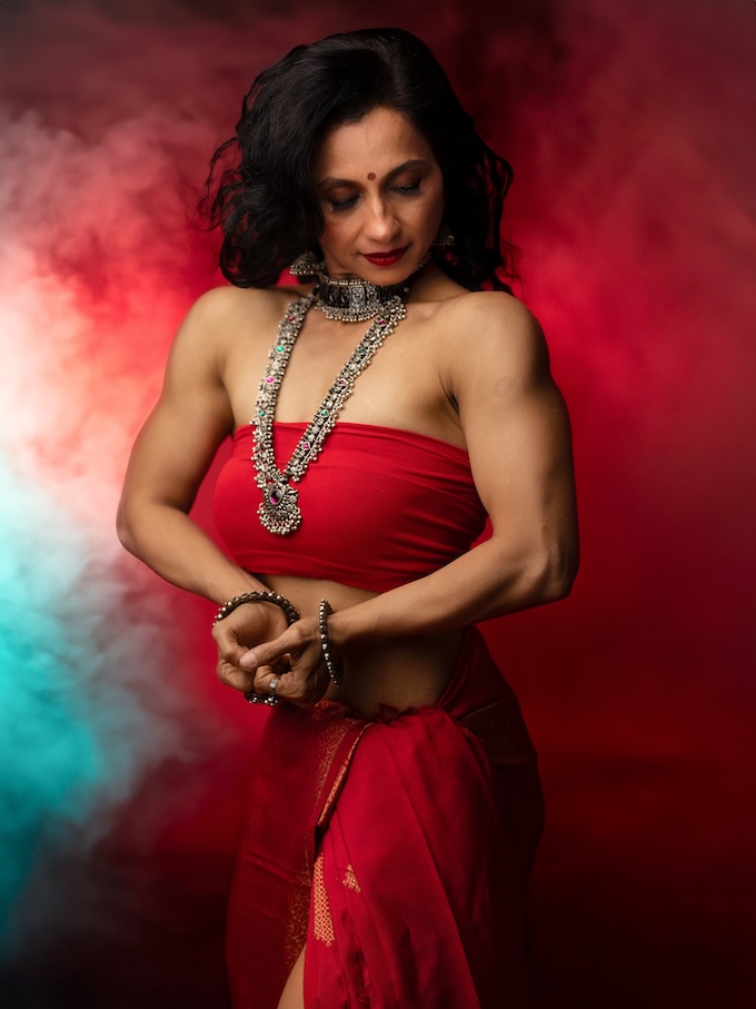
Goddesses Next Door: Empowering Everyday Women in India
March 20, 2024
That everyday women have goddesses within them is the radical notion that Bangalore, India, photographer Sudha Chandani Khatri makes evident in her portraiture of the women in her neighborhood. While glamour photography for everyday women has grown exponentially in popularity in the Western world, largely thanks to the work of portrait photography pioneer Sue Bryce and her mentees in The Portrait...
More »

How to Break into Concert Photography and Videography
December 21, 2023
Concert photography is a glamorous profession for the right person who loves music, traveling, and the roar of the crowd. David Lehr, a Nashville, Tennessee concert photographer recently caught up with Nikki Closser on The Portrait System Podcast to talk about how he got into concert photography and now works with country music star Morgan Wallen, taking pictures, shooting video, and...
More »