Lighting
Finding the Right LED Light: What You Need to Know To Get Accurate Color
March 16, 2017

So you finally sprang for a slick new LED light and loved how its versatile, lightweight design handled at your last gig. But now you’re editing your shots and wondering why the bride looks a little…green. The light looked fine during the event, and you even checked its Color Rendering Index (CRI) rating when you bought it to make sure it would capture colors accurately. So what gives?
It turns out that CRI numbers don’t tell the whole story about color rendition when it comes to LEDs. Even your eyes can be fooled. To get the details on what CRI ratings can (and can’t) tell you about an LED, and how to choose a light that will let you capture portraits with vibrant, natural skin tones, we talked to engineers at LED manufacturers Cineo and Fiilex.

The Skinny on CRI
Widely used by lighting manufacturers, the Color Rendering Index was devised by the CIE (Commission internationale de l’éclairage) during the 1960s to assess and quantify color fidelity. It evaluates how a light source renders eight standard color swatches, in comparison to a perfect illuminant with the same color temperature. How well the light renders each color swatch is rated on a scale from 0 to 100, and then the average is calculated to produce the CRI number. Look at most lights sold to photographers and you’ll find a CRI number in the 90s, which in principle indicates excellent color rendition.
But the devil is in the details. To begin with, producing an average number can mask important differences in the individual colors. “Consider two hypothetical lights,” says Fiilex optics engineer Sean Inaba. “One scores 0 on the first four samples and 100 on the second four. The second light scores four 100s followed by four 0s. These two lights would be completely different from each other, but both would have average CRI ratings of 50.”

CRI is a much more subtle measurement than a single number; it’s an average across multiple color measurements.
Another problem is that the eight colors, named R1 through R8, are fairly easy to render. “All the CRI score tells you is how well you reproduce eight pastel colors,” says Cineo Chief Technology Officer Chuck Edwards. Those hues are not very relevant to most photographers’ work. To address that problem, six well-saturated color swatches were later added to the CRI standard to create the more useful 14-color extended CRI. The additional colors include the R14 green representing foliage, the R13 swatch representing a Caucasian skin tone, and more saturated blue, green and yellow hues. A 15th color meant to represent an Asian skin tone is sometimes added as well.
The most relevant swatch for photographers who work with human subjects is R9, a strong, saturated red. Why? “The most important color is blood,” says Edwards. “Human beings are translucent bags of fluid, if you think about it. You can put a flashlight in your mouth and see light coming through.” Because the color of blood is fundamental to any skin tone, rendering that hue accurately is necessary for capturing healthy, natural- looking pictures of people. If the underlying red tone is off, people can look sallow or dull.
To make things even trickier, red is a particularly difficult hue for LEDs to render well. “Red light is on the edge of the visible spectrum, where the human eye is less sensitive,” notes Inaba. “An LED fixture could devote a significant portion of its wattage to reproducing ‘saturated red,’ but in doing so it would reduce its overall brightness to the human eye. Since brightness is such a strong selling point, and a low R9 score can be mitigated by a high average CRI, LED fixtures rarely focus heavily on R9.” In other words, if you see a bright, affordable LED with a high CRI, always check the details to see if it’s hiding a low R9 value that will make skin tones look off.
Even when a person looks natural to you under LED lighting, your camera might still produce disappointing results. “That’s because cameras see red better than the human eye,” Edwards says. “As a result of the LEDs cutting out that red, often it’ll look okay to the human eye, but when you photograph it, they look green-heavy. A lot of people actually have to do a minus green when using LED lighting versus conventional lighting because of that loss of red.”
The Right Light
So how can you make sure the LED you buy won’t make your clients look like they have the flu? The only way to be sure is to test it with the camera you plan to use it with. First, rule out any lights with an overall CRI number below 90, then look for R9 ratings in the mid to high 90s. The numbers will vary at different color temperatures, so check the R9 numbers for all temperatures if you’re looking at variable-color lights and consider the color temperature that you’ll typically use. Some manufacturers also provide test results for other standards, such as the Color Quality Scale (CQS) and Television Lighting Consistency Index (TLCI) numbers. Although those standards have their own set of complexities, CQS and TLCI numbers in the mid to high 90s are a good sign.
Once you’ve crossed the lower-rated lights off your list, find a rental house that carries your top candidates so that you can test them with a model. A person with any skin tone will work, although lighter skin tones are the most challenging to render well because they’re the most translucent. Take test shots at every available color temperature setting on the light.
Using the LED as the only source of illumination will show you how it performs in a studio setting, but make sure to test the light in a setting that’s close to your typical shooting situations too. “I would definitely test in an environment where you have direct sunlight competing with the light,” says Edwards, “something next to a window or in the kind of environment where you’re going to use it as a fill light.”
You can also rent a color meter to take an objective measurement of the color of the LED light falling on your model. But simply looking at your test images on a high-quality calibrated monitor and using Photoshop’s color sampler tool to check the RGB values in skin tones will tell you most of what you need to know—and much more than any CRI rating can.
Aimee Baldridge is a New York-based writer who covers the art, technology and business of photography and filmmaking.
Related Articles
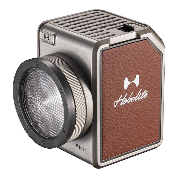
The Hobolite Micro—Perfection in a Pint-Sized Package
September 26, 2023
Form and function are perfectly matched with Hobolite’s latest release, the Hobolite Micro. This diminutive, bi-color, battery-powered LED light takes some of its cues from the company’s larger, more powerful siblings but doesn’t skimp on features. Yet it’s small enough to fit in the palm of your hand—or anywhere other lights are too bulky to fit, a special bonus for...
More »
How Francisco Joel Hernandez Adds Depth to His Portraits
March 6, 2023
WPPI 2023 speaker Francisco Joel Hernandez has been a fan of off camera flash for over a decade and loves sharing his process on social media.
More »
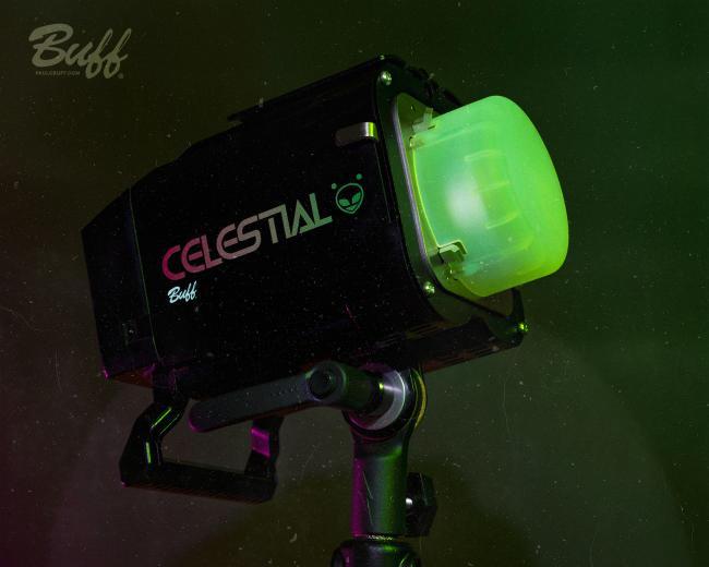
Paul C. Buff’s Celestial is a Powerful Battery-Powered Strobe
January 5, 2023
Lighting Company Paul C. Buff is best known for its studio lights—such as the Alien Bees and Einstein—but the company’s latest strobe is entirely battery powered. Arriving on Jan. 20, the Celestial is a battery-powered flash with up to 500 Ws of power and features like High Speed Sync. The Celestial: Battery Power Paul C. Buff’s Celestial delivers up to...
More »