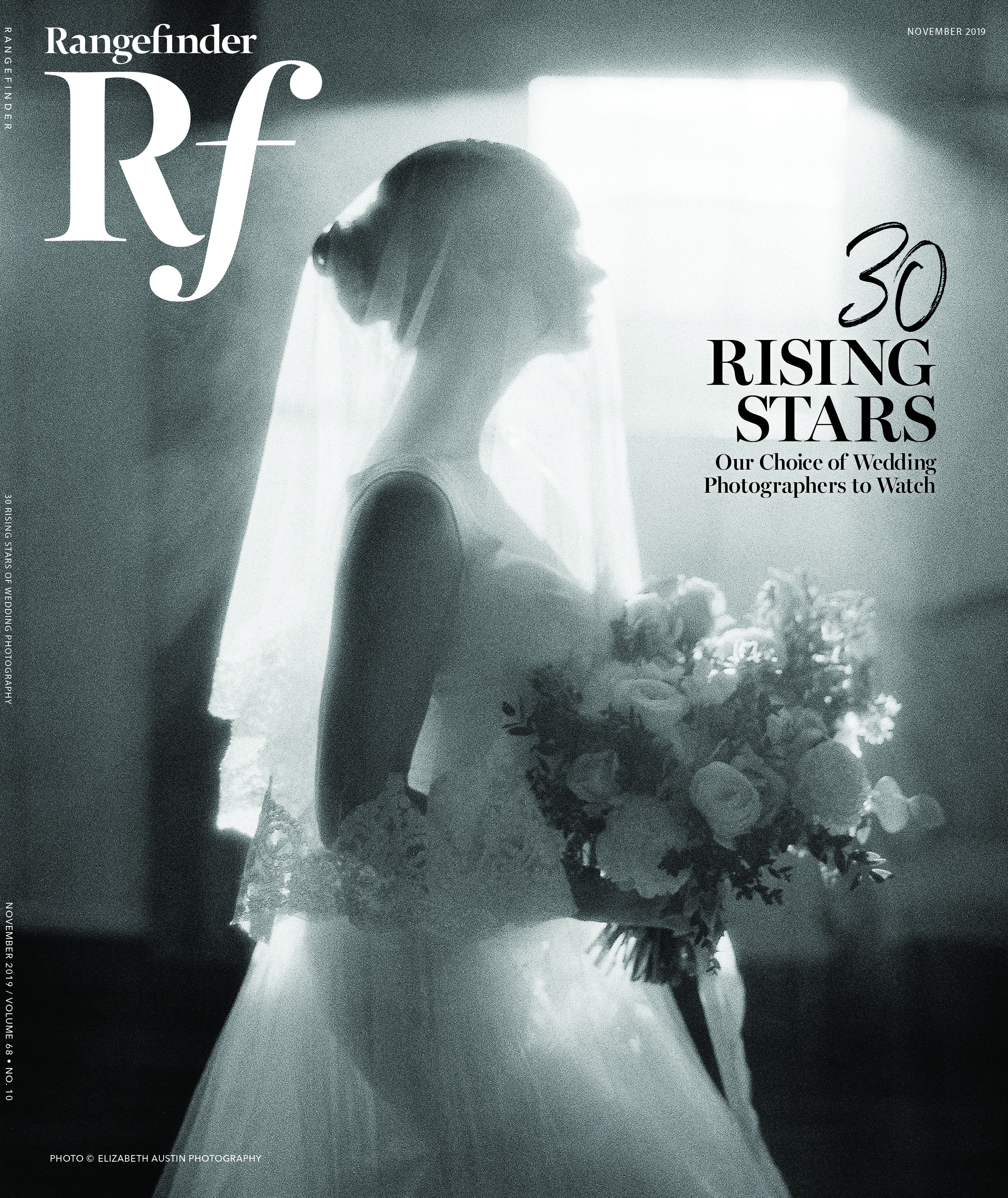
Best Website Templates for Photographers: Weigh the Options
October 11, 2013
With web technology and design trends in perpetual flux, staying fresh and relevant can be a daunting task. A website is a crucial part of a photographer’s identity, functioning as a portfolio, business card and storefront all rolled into one. We spoke to five experts who specialize in designing photography websites to help us break down some of today’s options and issues for you.
Getting Started
WordPress or Squarespace? liveBooks or PhotoShelter? Custom versus template? When it comes to building your website, how do you know what you need and when you’ll need it? This is one of the many problems that Ross Tanner, CEO of Flosites—a branding and interactive web design agency that builds custom websites on top of a WordPress base—works to overcome with clients.

Photographer Lara Jade’s web portfolio, designed by Flosites.
According to Tanner, a successful website is 60 percent consulting (understanding a client’s brand and objectives), and 40 percent actually building the design and layout.“[Your website] is a roadmap,” says Tanner. A good one, he says, recognizes where a business is and helps grow it to the next level.
Brock Martin of Infinet Design, a boutique web design agency, said his company’s process of building a site is similar. It all starts with a discussion about a client’s business and its needs. When clients have an identity (i.e. a logo and branding), it makes it far easier for Martin and his partner, Dave Warfel, to come up with ideas that fit that brand, both functionally and creatively.
For many, a custom website is not built into a business’ budget. In that case, a template website like Squarespace or liveBooks may be sufficient, especially if a photographer is just starting out. As Tanner puts it, if you were trying to lose weight, the first step might be to go to the gym and get on the treadmill before bringing in a personal trainer. Likewise, a DIY-template may be better than starting out custom.
Zach Schrock, a photographer and web designer, says Cargo Collective, a visual artist-specific template website builder, is a great alternative to a custom site. He uses Cargo Collective for his personal site because it’s “super easy to use,” and has a clean interface with a lot of room for customization.
According to Tanner, there are pros and cons to custom and template websites. “The benefit of going with something custom is that [a designer will] research and give you advice on how to market online, how you can boost traffic, and how you minimize the amount of clicks to get [visitors] to inquiries,” he says. The benefit of a prebuilt system is that software updates and fixes to bugs are automatically implemented. When an issue arises with custom websites, the client has to alert the web team to fix it. Without diligence, a site can easily become outdated.
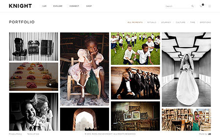
Wedding and lifestyle photographer Rose Oscar Knight’s website, designed by Flosites, features clean grids and content-intensive layouts.
The Battle Between Flash and HTML5
In 2010, Steve Jobs famously declared Flash “no longer necessary,” stating that HTML5 would “win” over other website building technologies. A few years ago, Adobe Flash was the dominant software for website building. Its robust technology allowed for complex animations, applications and video streaming. However, in 2008, the first implementation of HTML5 went into effect and, since then, many web designers have begun to build websites with HTML5 instead of Flash.
It is mostly a foregone conclusion among web developers that HTML5 will become the predominant web technology. For the less web-savvy, HTML is the markup language used as the framework for the Internet. It’s how pages are linked and the code by which many are built.
One of the greatest advantages of HTML5 is that all content, including video and audio players, is readable on both desktop and mobile browsers. For those who have ever visited a Flash website on an iPhone, this is a huge boon. Flash may produce more robust animations, but, as HTML5 develops, programmers and web designers are learning to create the same effects in HTML5.
Rob Haggart, founder of the site APhotoEditor.com and former Men’s Journal and Outside magazine director of photography, also founded APhotoFolio.com—a website-building platform aimed at commercial and editorial photographers with a nod to what photo editors like. It features a sleek, minimalist design that’s easy for users to customize. He agrees that HTML5 technology will become more and more powerful over time since the latest browsers automatically update. “As soon as people get rid of those legacy browsers, [HTML5] will really accelerate,” says Haggart. “Whenever new features come out, they can be implemented in all the browsers at the same time.

APhotoFolio’s websites, like this one displaying the work of lifestyle and fashion photographer Jessica Sample, are built to be visually appealing and easy for photo editors to quickly navigate and use.
However, HTML was not originally designed as a complete programming language and future advances in web technology (such as support for rich web applications and embedded video), were not anticipated when the language was first developed. As such, when these technologies arrived, plugins such as Adobe Flash flooded in to fill the gaps. Because Flash is a web application that sits on top of HTML, web designers began using it as an all-purpose means of developing; it was like building a skyscraper on a rickety wooden foundation.
HTML5 was seen as being able to rectify this problem as an update to the language that could handle the new technologies of the web, including streaming video, web apps and mobile devices.
Some web designers, though, are not so quick to dismiss Flash. Arseni Riajski of IhouseDesign, a New York-based web design firm, calls Flash a “superior technology.” HTML5 is “ten years behind Flash” in terms of what is achievable for programmers and web designers, Riajski says. Over the last year, he has found that most of his clients ask for HTML5 websites over Flash, even though they do not truly understand the difference between the two.
“[Clients] think the trend is HTML5, so this is what they should do,” says Riajski. “In reality, HTML5 is very often not the best technology to achieve perfection.”Haggart recently converted his platform from Flash to HTML5, but he acknowledges the reasoning behind it had more to do with industry perception than HTML5’s technological superiority. “There is a lot of hype in the industry around HTML5,” explains Haggart. “People didn’t want Flash but they didn’t know why.”
Flash, he adds, is a more precise tool than HTML5. When you build a website with Flash, he says, it is essentially an interactive movie—you can ensure that every element you place will go exactly where you want it. Unlike Flash, HTML5 requires the user’s browser to render the website. Because people use so many different browsers—some cutting-edge and some outdated—a website may appear different to every user. This inconsistency means that programmers working with HTML5 have to test websites in every potential browser.
Websites built with HTML5 only look great on the newest versions of browsers, says Haggart. That’s a problem when, according to NetMarketShare, almost a quarter of desktop web users are still using Internet Explorer 8 and earlier, which don’t support HTML5 video and audio embed tags. Most of these issues, however, stem from the relative newness of HTML5, and as the technology develops, most will be fixed.

An example of a navigational webpage design by Infinet Design for family lifestyle photographer Krista Grace.
The Rise of Responsive
Pete Cashmore, CEO of Mashable, recently declared 2013 the year of Responsive Web Design (RWD), and these days, it’s one of the hottest trends in web development. Created as a reaction to increasing variation in screen sizes—from smartphones to tablets to large monitors—RWD takes the guesswork out of how your website will show up on each screen.
Schrock calls RWD, “the Web 3.0” and “the best thing [photographers looking to build new websites] can do going forward.” So what is it, exactly? RWD is more of a web development style than any specific technology. It means designing your website to be adaptable for multiple screen sizes without developing mobile-specific versions of websites. RWD uses CSS3 queries to determine the size of the window—not the device—a person is using. It then adapts the look of the website to this size. If your open browser window is the same size as an iPhone screen, you will see exactly what an iPhone user would see, even if you were on your laptop. This is because the website is designed in a fluid grid that adapts the layout to the screen size using proportions.

Photographer Kristie Tweed’s website, created by Infinet Design, used designs and technologies based on what fit her brand as opposed to forcing the newest trend.
“You have a fully customized experience for anything,” explains Schrock. Building a responsive website requires a large amount of work because programmers essentially have to develop and test website layouts for every different screen size. Although his method of developing is powerful and will make your website look slick, as Schrock notes, “It’s time intensive and costly, and not everyone wants to pay for it.”
Because RWD is device-agnostic, many users and web designers are excited about getting rid of the mobile websites that have become predominant for smartphone users. However, views were mixed on RWD being the best option for those accessing websites on their smartphones.
“I think a responsive design is lazy,” says Haggart. “You can optimize for the device [with a mobile website]…we’re heading toward an era where people will primarily run into your website first with an iPhone or an iPad, and you want to make a huge impression there if you can.”
Haggart points to interfaces that take advantage of touch screen gestures, larger buttons for navigation and images sized for smartphones as reasons for sticking with a mobile version of a website over a responsive design. In his experience, these features make websites easier for smartphone users to navigate and far faster to load, an issue when users are accessing websites over cellular connections.

One of Ihouse Design’s minimalistic pages, created for commercial and fine-art photographer, Christopher Wilson.
Each of the web designers we asked had a different solution for the responsive versus mobile debate. Riajski felt that the best solution was to build Flash websites for desktop users and specific mobile versions for both Android and iPhone. Tanner has found that a combination between a responsive design and a mobile website is the way to go. Flosites develops six versions of every website for each screen size and, if the designers feel it’s necessary, will add specific user interface adjustments if the website is accessed on a smartphone. Martin typically builds a single website for both mobile and desktop and then, if during the testing phase he finds bugs, he will add minor tweaks for those on mobile or tablet.
Custom versus template and HTML versus Flash are only two considerations for photographers who are thinking about designing their online portfolio. New innovations in website design are constantly cropping up—being informed is only the first step to creating a stellar platform for displaying your work.
Related Articles

Boost Your Sales Revenue and Turn Clients into Raving Fans and Referral Machines
April 24, 2024
If you’re tired of losing potential sales and want to know how to not just close deals but also keep your clients coming back for more, today, we’re diving deep into the power of sales in your portrait business. The Sales Journey It is a common misconception that sales are confined to the final ordering session. In reality, the sales...
More »

From Weddings to Senior Portraits: When Clients Return
March 28, 2024
Jihan Cerda is a stunning wedding photographer, who also happens to shoot engagements, maternity, newborns, families, and high school seniors. In fact, it’s no accident. Many of Cerda’s subjects are return clients who come to her for engagement shoots and stick with her through all the phases of their blossoming relationships and growing families. Cerda says, “There’s something about giving...
More »
Goddesses Next Door: Empowering Everyday Women in India
March 20, 2024
That everyday women have goddesses within them is the radical notion that Bangalore, India, photographer Sudha Chandani Khatri makes evident in her portraiture of the women in her neighborhood. While glamour photography for everyday women has grown exponentially in popularity in the Western world, largely thanks to the work of portrait photography pioneer Sue Bryce and her mentees in The Portrait...
More »